- ● homepage
- ● archives
- ● restoration
- ● books
- ● big banners
- ● post board
- ■ neo's search
- ■ about us
- ■ 게재방법 안내
- 개인정보처리방침
- [email protected]
- Tel. 02_335_7922
- Fax. 02_335_7929
- 10:00am~04:30pm
- 월요일~금요일
- 3/3(월) 대체공휴일

Decade_불안과 반항
권태섭展 / KWONTAESUB / 權太燮 / painting 2024_0927 ▶ 2024_1016 / 일,월요일 휴관

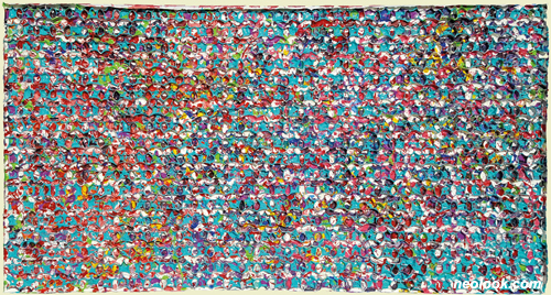
- 권태섭_별 580-61_한지에 아크릴채색_120×175cm_2017
별도의 초대일시가 없습니다.
아트레온 갤러리 초대작가展
후원 / (주)아트레온 주최 / 아트레온 아트센터 기획 / 아트레온 갤러리
관람시간 / 11:00am~06:00pm / 일,월요일 휴관
아트레온 갤러리 Artreon Gallery 서울 서대문구 신촌로 129 (창천동 20-25번지) B1,2층 Tel. +82.(0)2.364.8900 www.artreon.co.kr
권태섭 작가는 1965년생으로 서울에서 태어났다. 선화예술고등학교를 졸업하고, 홍익대학교 미술대학 동양화과, 동대학원을 졸업했다. 이러한 과정은 그림에 대한 기초 학문과 실기를 쌓게 했고, 그의 회화적 입지를 넓혔다. 또한 재료에 대한 다양하고 끊임없는 연구와 실험을 통해 한국 고유의 채색을 본인만의 해석으로 작업하며 한 단계 진일보 하고 있다. 그의 작업은 새로운 것을 찾기위한 열망과 그것을 실현하기 위한 적극적인 노동력으로 표현된다. 화면 표면에 있어서는 단순함을 선택한다. 단순 반복적 행위가 추구하는 것은 화면의 무게감, 시각적 안정감이다. 강렬한 색채로 표출되는 그의 작업은 관람자로 하여금 좀 더 시각적으로 본능적인 자극을 갖게 한다. 최근의 작업 과정은 그 자신뿐아니라 우리 모두의 삶을 표현하고 있다. 내가 태어나고 생활하며 삶을 지속하고 있는 공간에 대한 표현인 것이다. 다소 단순하게 보이지만, 열정과 냉정함 그리고 자율적 행위를 내포하고 있다. 앞으로의 작업이 어떠한 방향으로 변화할지 모르겠지만, 작가는 지금까지 추구해 왔듯, 작업을 통해 나의 것, 우리의 것을 찾아낼 것이다. ■ 아트레온 갤러리
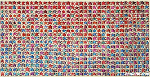
- 권태섭_섬, 바다, 별_한지에 아크릴채색_68×122cm_2019
- 권태섭_나의 별_한지에 아크릴채색_68×122cm_2019

- 권태섭_여름에 향연_한지에 아크릴채색_140×174cm_2019
나의 작업은 기다림의 시간과 그것을 즐길 수 있는 마음의 여유이다. 자르고 펼치고 붙이고 말리고 칠하고 밀리는 과정은 단순하고 지루할 수 있지만, 작업과 나에 대한 많은 생각을 하게 되는 시간이기도 하다. 내게 있어 단순함은 간결한 압축의 행위이며, 이는 채색, 그 중 원색에 있다. 원색이 가지고 있는 분명함은 시각적 심리적 안정감까지, 모든 색감에 있어 기본이 된다. 원색과 원색의 혼합에서 파생되는 수많은 색상들은 복잡한 수학적 비율로 다양한 색상을 만들어낸다. 본능과 경험에 의한 느낌이기 때문이다. 나의 작업 또한 그러한 것이다. 한지와 수간채색은 동양화를 시작한 이후 지금까지 나의 생각을 시각적으로 표현이 가능하게 만들어준 재료이다. 한지는 어머니와 같다. 형상을 만들어주는 모태가 되어주며 유연하고 거친 동시에 편안함을 가지고 있다면, 분채(수간채색)는(은) 거칠고 예민하며 불편함까지도 가지고 있는 마치 사춘기의 아이 같은 성질을 가지고 있다. 이 비슷하면서도 명확히 다른 두 재료의 특성과 특색을 잘 이해한다면 그 매력적 발색의 결과물은 명확한 형태와 색상으로 드러난다. 하나의 작품이 완성되기 위한 지속적인 관찰과 실험정신을 통한 경험만이 앞으로 작업의 완성도를 높일 수 있다.

- 권태섭_평행선_한지에 아크릴채색_54.5×45cm_2019

- 권태섭_무언수행이미지_한지에 수간채색_123×115cm_2021
- 권태섭_정적, 움직임_한지에 분채, 아크릴채색_95×120cm_2021
- 권태섭_무언수행이미지_한지에 분채, 아크릴채색_60.5×44cm_2021

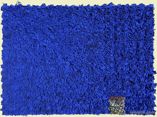
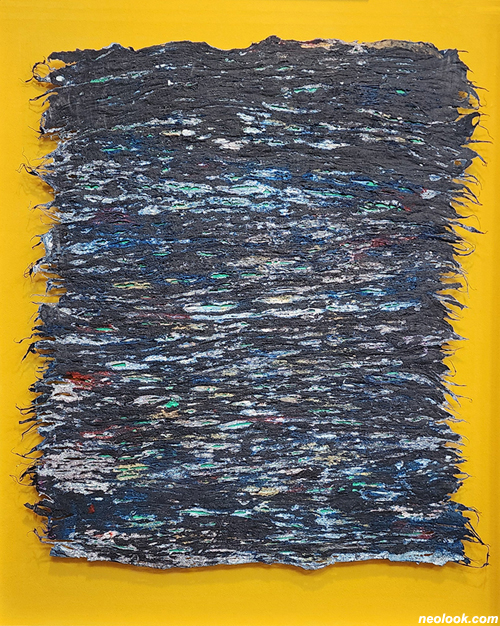
- 권태섭_무언수행이미지_한지에 분채_203×126cm_2021

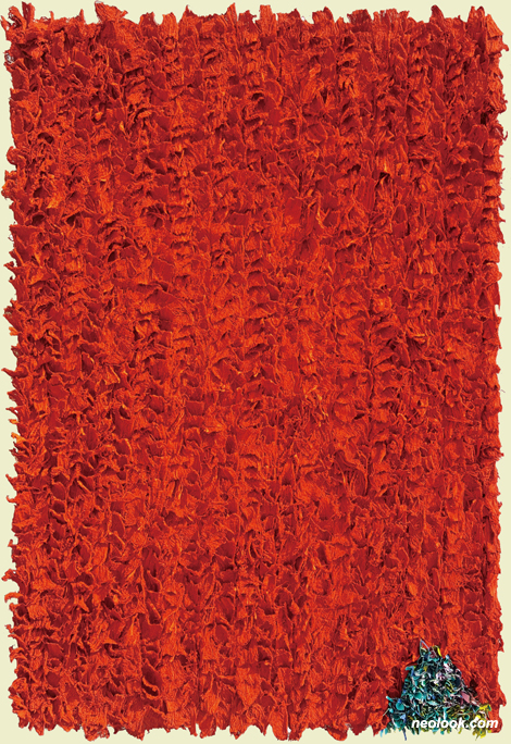
- 권태섭_무언수행이미지_한지에 분채_145.5×227.5cm_2021
하나의 작업과정은 그 모티브와 어울리는 본연의 채색방법을 찾아가는 과정이자 시각적 변화에 있어 중요한 과정이다. 화면의 변화에 있어 평면성과 입체적 느낌과 특징을 표현할 수 있는 부조 회화의 변화를 찾아가고 있다. 이전의 작업은 약간의 마띠에르를 이용한 변화를 주었다면, 그 변화를 견고하고 유연한 재료인 한지를 사용하여 조금 더 자유로운 형태와 형식을 추구했다. 한지 특유의 내구성으로 인한 계획된 효과와 우연적 효과를 동시에 노출했으며, 현재의 작업과정은 감각과 느낌, 불규칙적 변화에 대한 반응을 작업에 적용 중이다. 이 과정은 나에게 있어 하나의 작업 세계로 진일보하려는 노력의 과정이다. ■ 권태섭
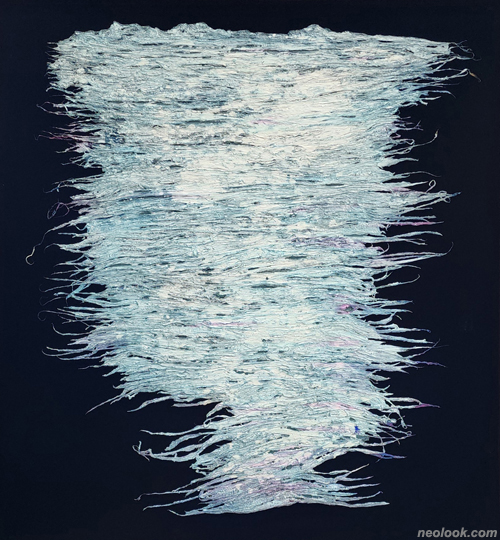
- 권태섭_윤슬 sun-glitter_한지원료에 수간채색_74×65cm_2024

- 권태섭_윤슬 sun-glitter_한지원료에 수간채색_215×122cm_2024
- 권태섭_윤슬 sun-glitter_한지원료에 수간채색_72×62cm_2024

- 권태섭_윤슬 sun-glitter_한지원료에 수간채색_70×65cm_2024
Kwon Taesub, born in 1965, Seoul, Korea. After graduating Sunhwa Arts High School, he entered Hongik Univeristy College Of Art, specialized Oriental Art, went to the Graduate – School of Hongik University. By this process, he was able to expand his position of painting by consistently researching basic theory of art and drawing. Also by doing experiments about raw materials, he was able to make advance his own meaning of painting. His works show the desire to find new things and hard works. The surface was chosen to look simple. The meaning of simple, to Kwon, was to be visioned comfortable, but not shown light. By exposing his works with strong colors, it made the audience have more visually instinctive stimuli. Recent works show the life of not only him, but everyone. It expresses sense of the place of birth, work places, and home. It may look monotonus, but contains passion, stable, and willness for freedom. The works can change, but as he has always been doing, he will endeavor to find what we all used to have. ■ Artreon Gallery
Artworks are patience and the inner peace to enjoy it. Cutting,opening, pasting... These process may be monotonous and boring but at the same time it give time to think more about myself and the works. For me, monotonous is a motion of simple compression, which is coloring (especially the primary color). The obviuosness the primary color has (sight and mental stability) is a basic of every other colors. The wide variety of the mixed scale between primary colors lead to numerous complex colors. The complexity comes from the instinct and experience of an artist and so does my works. Traditional Korean Paper and powder color are the main ingredients for me to express my values visually starting from the day I started Oriental Painting. Traditional Korean Paper is like a mother. It is both harsh and soft and the same time and also flexible to become a motivation of every object. On the other hand, powder color is sensitive and even has uncomfort itself. If the traditional paper is like a mother, the powder color can be compared as a 12 year old child. As soon as we get to know the similar but obviously different two elements, the result of these attractive color develpoment will be an obvious shape and color. Only consistent observation and experiment will lift the perfection of the artwork. ● A progress is a way to find a motivation and it's own color and crucial for visual changes. It's finding a new way of relief painting, a way to express flatness, feeling of third dimension. If the works before gave a little change by using a little Matiere, works these days use dense and flexible traditional paper to pursue more free shape and form. Planned and unexpecetd effects by the stablility of Korean traditional paper itself exposed are to show sense and feelings, reaction on irregular changes. This also is a progress of my ongoing artworks. ■ Kwon Taesub
Vol.20240927e | 권태섭展 / KWONTAESUB / 權太燮 / painting