- ● homepage
- ● archives
- ● restoration
- ● books
- ● big banners
- ● post board
- ■ neo's search
- ■ about us
- ■ 게재방법 안내
- 개인정보처리방침
- [email protected]
- Tel. 02_335_7922
- Fax. 02_335_7929
- 10:00am~04:30pm
- 월요일~금요일
- 3/3(월) 대체공휴일

진정한 색, 블루 TRUE-BLUE
김지훈展 / KIMJIHUN / 金志勳 / painting 2021_1005 ▶ 2021_1030 / 일,월,공휴일 휴관

- 김지훈_진정한 색, 블루 TRUE-BLUE展_스펙트럼 갤러리_2021
● 위 이미지를 클릭하면 김지훈 유튜브로 갑니다.
별도의 초대일시가 없습니다.
관람시간 / 12:00pm~07:00pm / 일,월,공휴일 휴관
스펙트럼 갤러리 SPECTRUM GALLERY 서울 용산구 회나무로32길 2-3 (이태원동 211-22번지) Tel. +82.(0)2.6397.2212 www.spectrumgallery.co.kr @spectrumgallery_official
『TRUE-BLUE(진정한 색, 블루)』에 관한 잡문 "푸른색으로 가득 뒤덮힌 우주로 들어서기 전에 잠시 생각해봅니다. 세상만물을 감각으로 상응하는 우리의 세계에서 예측 가능한 일이란 있을 수 없다는 것을 말입니다. 코앞의 미래조차 장담할 수 없다는 섬뜩한 진리는 인간에게 안정이란 허상으로 다가와 마음을 기울이게 합니다. 그곳에 향하기로 한 우리의 영혼과 감각이 동행하는 삶이라는 찬란한 시간을, 헛되지않게, 그렇게 온전히 버텨내야 할 것입니다."

- 김지훈_True-Blue No.8_알루미늄에 유채(직접 제조한 물감)_70×70×5cm_2021
앞선 잡문은 좋은 글일수록 짧고 간결하다는 진리를 몸소 행하려던 어린 화가의 몸부림정도로 봐주면 좋겠다. 아무튼 나는 짧지 않은 시간동안 '읽는 그림보단 보는 그림'이란 다소 뻔한 슬로건을 앞세워 꾸준하게 고집을 부려왔다. 언젠가 모 재단의 수상심사평 명목으로 '강력한 이미지로 트렌드에서 비껴나 나름의 모색을 한다고 여겨지나 약간 진부한 면이 있어 아쉬움이 남는다'라는 묘하게 찜찜한 문장으로 공표 된 적이 있는데, 그냥 그렇다니 그런가보다 했던 기억이 있다. 다만, 『TRUE-BLUE(2021~)』연작만큼은 회화라는 순수한 물질 자체에 관한 집중과 선망이 담긴 결정체라는 점을 강조하고 싶다.

- 김지훈_True-Blue No.6_캔버스에 유채(직접 제조한 물감)_130×130×3cm_2021
『TRUE-BLUE(진정한 색, 블루)』란 타이틀은 몇 가지의 확고한 근거를 토대로 명명되었다. 첫째, 파란색은 오래 전부터 충실함을 상징하는 색으로 여겨졌다는 점. 둘째, 신념을 굽히지 않는 태도를 지닌 인물을 일컫는 말이기도 하다는 점 또한 잠시 머물다 사라 질 트렌드에 매몰되지 않으려는 나의 세계관과의 일관성이 있다는 점 등이 있다. 좀 더 현실적인 언어로 말해보겠다. 마그네슘의 결핍은 눈 밑 경련이란 신체반응을 불러오듯 특정 색에 대한 케케묵은 열등감은 회화를 통한 극복의지로 구체화되었는데, 그 색이 바로 파란색이었다. 견습생 시절까지 거슬러 올라가다보니 '나는 왜 지금껏 파란색에게 단 한 번도 떳떳하지 못했을까'라는 의문에 도달했다. 딱히 특별한 이유가 있었던 것은 아니지만 이상하게도 그랬다. 인간은 본능적으로 공포를 피하는 존재다. 따라서 한편으론 나의 육감이 제 역할을 잘 해낸 것 이라고도 볼 수 있다. 다만 나는 여태 회화를 통해 공포를 피하기보단 정면으로 마주하고 극복해왔기에 파란색은 또 하나의 극복대상이 됨과 동시에 TRUE-BLUE 연작의 원동력이 되었다.

- 김지훈_True-Blue No.1_알루미늄에 유채(직접 제조한 물감)_90×70×5cm_2021

- 김지훈_True-Blue No.2_알루미늄에 유채(직접 제조한 물감)_90×70×5cm_2021

- 김지훈_True-Blue No.10_캔버스에 유채(직접 제조한 물감)_130×194×5cm_2021
나는 지난 몇 년간 작품의 보편성이란 파도에 휩쓸리지 않기 위해 재료적 독창성에 집중해왔다. 그 무렵, 파란색이 뿜어내는 특유의 묵직한 압력이 소용돌이치는 대자연의 풍광들에 대한 중화제로 작용된다는 점을 목격했다. 한마디로 감상자로 하여금 대자연이라는 위대하고 숭고하지만 한편으론 다소 부담스러운 존재에 대해, 평온한 느낌을 자아낼 수 있다는 가능성을 찾게 된 이후 연작에 대한 당위성은 한층 더 두터워졌다. 때마침 나는 조금 더 나아가보고 싶었다. 그래서 관습적인 캔버스 프레임을 벗어던지고 견고하게 제련 된 알루미늄 판 위에 직접 제조한 물감을 칠하기에 이르렀다. 아이러니하게도 결국 나는 보편성의 파도에 저항하기 위해 파도를 그렸다.
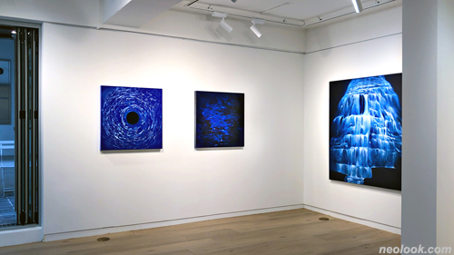
- 김지훈_진정한 색, 블루 TRUE-BLUE展_스펙트럼 갤러리_2021
오늘이 가져다 줄 미래는 꽤나 값질 것이라 본다. 삶 속에 내제 된 불확실성에 대한 탐구과정은 오늘의 파란색으로 기록될 것이다. 앞으로의 행보에 대해 덧붙이자니 그것은 마치 수심을 알수 없는 작품 속 심해와 같아서 뭐라 장담할 순 없다. 다만 한 가지 확실한 건 조금 더 거세게 고집부릴 준비가 되어있다는 것 정도다. (후략) ■ 김지훈
About 『TRUE-BLUE (True Color, Blue)』 Think for a moment before entering the blue-filled universe. It means that nothing is predictable in our world, where everything corresponds to our senses. The terrifying truth that we cannot even predict the nearest future approaches us as an illusion of stability and tilts our minds. We will have to endure and not waste the splendid time of life in which our souls and senses accompany us. ● I would like to see the above miscellaneous texts as the struggles of a young artist who tried to practice the truth that the better the writing, the shorter and more concise. Anyway, I have been persistently insisting on the rather obvious slogan of 'pictures to see rather than pictures to read' for a short period of time. One day, as the name of an award review by a certain foundation, it was published with a strangely poignant sentence, 'It is thought that he deviates from the trend with a strong image and seeks his own, but it is a bit banal, so it is a pity', but I remember thinking it was just that. . However, I would like to emphasize that the 『TRUE-BLUE (2021~)』 series is a crystal that contains concentration and envy about the pure substance of painting itself. ● The title "TRUE-BLUE" was named on several solid grounds. First, blue has long been considered a color symbolizing fidelity. Second, it also refers to a person with an attitude that does not bend their beliefs, and it is consistent with my worldview, which I do not want to be caught up in by a trend that will stay for a while and disappear. Let me try to speak in a more realistic language. Just as magnesium deficiency provokes a body reaction called convulsions under the eyes, the old feeling of inferiority towards a specific color was embodied as a will to overcome through painting, and that color was blue. Going back to when I was an apprentice, I came to the question, "Why have I never been proud of blue?" There was no particular reason, but strangely it was. Humans instinctively avoid fear. So, on the one hand, it can be said that my sixth sense has done its job well. However, since I have been facing and overcoming fear rather than avoiding it through painting so far, blue became another object of overcoming and at the same time became the driving force of the TRUE-BLUE series. ● For the past few years, I have focused on the originality of the material in order not to be swept away by the wave of universality of my work. Around that time, I witnessed that the unique heavy pressure emitted by blue acts as a neutralizer for the swirling scenery of Mother Nature. In a word, the justification for the series became even stronger after the viewer found the possibility of creating a sense of calm about the great and sublime but somewhat burdensome existence of Mother Nature. At some point, I wanted to go a little further. So I threw off the conventional canvas frame and came to paint my own paints on a solidly smelted aluminum plate. Ironically, in the end, I painted waves to resist the waves of universality. ● I think the future that today will bring will be quite valuable. The process of exploring the uncertainty inherent in life will be recorded in blue today. As for the future steps, it's like the deep sea in the work where the depth of the water is unknown, so I can't say for sure. One thing is for sure, however, is that they are prepared to push themselves a little harder. (omitted below) ■ KIM JI HUN
Vol.20211005a | 김지훈展 / KIMJIHUN / 金志勳 / painting