- ● homepage
- ● archives
- ● restoration
- ● books
- ● big banners
- ● post board
- ■ neo's search
- ■ about us
- ■ 게재방법 안내
- 개인정보처리방침
- [email protected]
- Tel. 02_335_7922
- Fax. 02_335_7929
- 10:00am~04:30pm
- 월요일~금요일
- 3/3(월) 대체공휴일

Agnes and Seunghwans 아그네스와 승환스
차승언展 / CHASEUNGEAN / 車昇彦 / weaving.painting 2014_1127 ▶ 2014_1223 / 일,공휴일 휴관
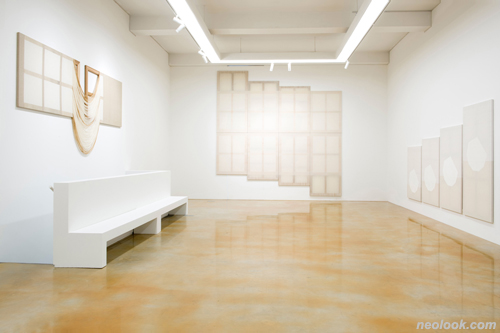
- 차승언_Agnes and Seunghwans展_살롱 드 에이치_2014
● 위 이미지를 클릭하면 네오룩 아카이브 Vol.20121105f | 차승언展으로 갑니다.
초대일시 / 2014_1127_목요일_06:00pm
후원 / 서울문화재단
관람시간 / 11:00am~07:00pm / 토_11:00am~06:00pm / 일,공휴일 휴관
살롱 드 에이치 Salon de H 서울 강남구 청담동 31-2번지 신관 1,2층 Tel. +82.2.546.0853 www.salondeh.com
어떤 이야기: 좀비-모던의 상황과 인식 ; 차승언의 직조 행위를 이해하는 데 도움이 되는 ● 2008년의 금융 위기 이후 현대미술은 본질적인 변화를 겪고 있습니다. 예술의 사회적 존재 형식과 작업을 전개하는 방법론 차원 모두에서 어떤 큰 전환이 이뤄지고 있죠. 이를 어떻게 설명해야 좋을까요. ● 현대미술의 세계에서 당대미술의 시대는 조용히 대단원의 막을 내렸습니다. 혹자는 인정하고 싶지 않을지도 모르겠지만, 컨템퍼러리의 시대는 완전히 끝장났습니다. 모더니즘의 거탑을 와르르 무너뜨리며 신나게 놀던 시대가 저물고, 바야흐로 초납작(superflat)한 폐허의 세상에 비역사/메타-서사의 파편이 끝없이 펼쳐지는 형국이죠. 아직 현황 파악이 안 되는 이들이 많은 모양이지만, 단언컨대 ‘컨템퍼러리 아트’는 끝났습니다. ● 고원의 비유로 인간사를 되돌아볼 수 있던 시대도, 훈고학적 놀이가 아니라면, 끝났다는 뜻이죠. 제도적 차원에서 변형 모더니즘이 사회 문화의 근간을 지탱하지만, 그 시대감각은 모던도 아니고 컨템퍼러리도 아닙니다. 2015년대를 사는 우리에겐 이제 시대성이란 것이 존재하지 않아요. 각자의 시간을 살고 있을 따름입니다. 그러다보니, 세계 곳곳에서 현대성의 이름으로 억압해놓았던 미개함이 속속 일상의 전면으로 귀환하고 있죠. 이러한 경향은 앞으로 더욱 심화할 것입니다. ● 미술관, 대학, 전시, 작가와 평론가의 관계 등 제도적 현실을 보면, 각 부문을 지배하는 사회·문화적 행위 프로토콜은, 여전히 모더니즘의 방식을 따릅니다. 이데아를 잃고 습속으로 퇴행한, 변형 모더니즘이 미술계를 지탱하고 있는 셈인데, 그 외형은 과거와 다를 바 없어요. 따라서, 자세히 살펴보지 않으면 이러한 문제적 변화와 그 의미를 감지하기 어려울 수도 있습니다. 영혼을 잃고 움직이는 몸만 남은 이념, 즉 좀비화한 이념으로서의 모더니즘, 그걸 나는 좀비-모더니즘이라고 부릅니다. 더 나아가, 포스트모더니즘의 문제의식이 거의 완전히 소진된 2008년 이후의 상황을, 좀비-모던의 시대, 즉 좀비화한 시대 아닌 시대로 규정합니다. ● 좀비-모던의 시대의 특징적 징후 가운데 하나는, 이미지-사물 혹은 사물-이미지의 물신성이 저하하거나 사라지는 것입니다. 과거엔 이미지의 아날로그적 반복을 통해 물신성을 축적-강화할 수 있었지만, 스마트 기기로 연결된 인터넷 세계에서 이미지의 반복-노출은 물신성을 저해하는 기회의 증가로 이어집니다. 따라서, 상품의 물신성과 그 구현 체계를 작업으로 의태(mimesis)하는 전략을 고수해온 포스트모던 세대 미술가들의 앞날은 몹시 어두워요. 그들의 시대는 다시 오지 않을 겁니다.
- 차승언_Bright Richard on Honeysuckle 100_면사, 합성사, 아크릴물감_165×97×3cm_2014
스마트 기기로 연결되는 인터넷 세계와 그를 통해 재매개된 실재계 모두에서 이미지는, 검색/조작 가능한 정보에 불과하기 때문에, 보는 이를 압도하지 못하는 양순한 기호로 전락하고 맙니다. 이는 단지 2D 이미지의 물신성만 해치는 게 아니다. 저가 3D 프린터의 광범위한 보급으로 인해, 이제 3D 오브제의 물신성도 파괴되고 있죠. 단지 구상과 제작의 어려움이 해소된 탓만은 아닙니다. 3D가 과거와 달리 이미지처럼 느껴지는 것은, 실제로 그것이 컴퓨터 그래픽스의 3D로 렌더링된 오브젝트, 즉 다각적 매핑 이미지의 출력본이기 때문이에요. 이미지 정보로 치환 가능하다는 것을 드러내는 3D 사물은 이제 과거와 같은 수준의 물신성을 지닐 수 없습니다. ● 2D건 3D건, 이미지에 부여된 새로운 ‘정보적/테이터적 리얼리티’는 물신성을 중화해버립니다. J. 데이비드 볼터와 리처드 그루신(J. David Bolter & Richard Grusin)의 비유를 빌자면, 이렇게 설명할 수 있어요: 이미지의 재매개(re-mediation) 과정에서 하이퍼매개(hypermediacy)의 차원이 촉지 가능한 가시적 부가 정보의 조합으로 전환됨에 따라, 투명성의 비매개(transparent immediacy)를 통해 강화되던 사물-이미지/이미지-사물의 물신성은 해체/해소되고 만다고요. (비고: 특정 정보가 촉지를 통해 통제 가능하다는 사실/느낌은, 단지 접근 가능하다는 것 이상의 의미를 지닙니다.) ● 이러한 물신성 저하와 실종의 시대를 맞아, 이미지/비이미지를 다루는 새로운 세대의 현대미술가와 현대디자이너는 현실 인식을 새로이 수정하는 데서 재출발을 시도하는데, 가장 중요한 것은 ‘(죽기를 거부하는) 20세기가 이제 거의 모든 인간 활동의 규준이 되는, 수정 불가능한 의사-자율성의 데이터베이스’가 됐다는 점을 인식하는 일입니다. ● 고화질 영상과 정보로 끊임없이 우리 앞에 되살아오는 20세기는, 21세기의 인간을 옥죄는 템플릿이며, 일찌감치 (아마도 1980년대의 어느 어느 시점에) 미래를 상실한 현재는, 이제 생생한 과거에게 제자리를 잠식당하는 위기에 처했습니다. 2010년대의 오늘, 인간을 압도하고 추동하는 힘은 ‘새로운 것(the new)’이 아니라 ‘오래된 것(the old)’—20세기 현대미술의 역사를 포함하는—에 있다고 확언합니다. 이 새로운 ‘오래된 것’은, 전통이 될 수 없는, 낡기를 거부하는, 20세기의 기록-데이터베이스로서, 스킨처럼 초납작해진 21세기의 시공간을 (그리고 그 속에서 살아가는 우리를) 두고두고 지배할 판입니다. ● 로버트 휴즈(Robert Hughes)가 20세기 문화 예술의 핵심을 “새로운 것의 충격”(과 인간의 문화적/예술적 대응)으로 설명했다면, 이제 막 본격화한 21세기의 기대 감소 시대는 “(낡기를 거부하는) 오래된 것의 충격”(과 인간의 문화적 예술적 [무]대응)으로 해설될 수 있을 것입니다. 그렇다면, 2015년 현재, 예술가들의 유의미한 대응으론 어떤 것을 꼽을 수 있을까요?

- 차승언_Bright Richard on Honeysuckle_면사, 합성사, 아크릴물감_2014 차승언_Brighter Richard on Honeysuckle_면사, 합성사, 아크릴물감_2014
2008년 이후 북미를 중심으로, 새로운 추상미술가들이 동시다발적으로 나타났습니다. (물론, 오래전부터 새로운 추상을 작업으로 탐구해오다가, 2008년 이후에야 비로소 주목을 받게 된 경우가 적지 않습니다.) 작가의 수가 무척 많아서 목록의 형태로 일별하기 어려울 정도죠. 경향은 다종다양합니다만, 과거의 추상미술이 다뤘던 주제-물(subject matter)의 어떤 차원을 오늘의 시점에서 재방문해 새로이 재구성한다는 것이 공통점입니다. 그 과정에서 2D 이미지를 3D로 다루고, 3D를 이미지로 다룸으로써, 회화와 조각을 다시 하나로 결합하려는 충동을 드러내는 것도, 새로운 추상미술의 특징 가운데 하나입니다. ● 벌써 크고 작은 개괄 작업이 이뤄졌습니다. 그 누구보다 먼저 새로운 추상미술의 경향을 갈무리한 것은 평론가/큐레이터 밥 니카스(Bob Nickas)였습니다. 그의 책 『추상을 그리기: 추상회화의 새로운 요소들(Painting Abstraction: New Elements in Abstract Painting)』(Phaidon Press, 2009)은, 2009년을 기준으로 지난 약 5년간의 신경향을 80명의 작가로 총망라해 꽤 주목을 받았지만, 비평적 핵심을 포착한 것은 아니었습니다. ● 안네 링 페테르센(Anne Ring Petersen), 미켈 보흐(Mikkel Bogh), 한스 담 그리슈텐센(Hans Dam Christensen), 페터 노르가르트 라르센(Peter Norgaard Larsen)이 편집한 『맥락 속의 당대 회화(Contemporary Painting in Context)』(Museum Tusculanum Press, 2010)가 비평적 향방을 잡은 첫 출판 기획이었어요. 메타-이론이 크게 쇠퇴해버린 상황인지라, 대대적인 반향을 불러일으키는 못했죠. 하지만, 미디어이론가/큐레이터인 페터 바이벨의 1990년대 회화에 대한 비평적 회고나, 미술언론인/평론가 배리 슈왑스키의 회화의 존재론에 대한 성찰, 새로운 추상회화의 개척자인 카타리나 그로쎄의 제 작업 해설 등이 유사한 작업을 펼쳐온 미술가들에게 상당한 자극이 됐습니다. ● 미술관 전시도 뒤를 이었습니다. 미 매사추세츠 드코르도바조각공원/미술관(DeCordova Sculpture Park and Museum)에서 열린 18인전 『사물을 그리기: 스트레처 너머로(PAINT THINGS: beyond the stretcher)』(2012년 1월 27일- 2013년 4월 21일)는, 3D 오브제로 해석되며 점차 공간으로 전화하는 새로운 추상회화의 경향을 일람하는 기회가 됐습니다. 미술관 큐레이터인 디나 디치(Dina Deitsch)와 초청 큐레이터인 이반 가르자(Evan Garza)의 기획이었죠. (참여 작가: 클레어 애슐리[Claire Ashley], 케이티 벨[Katie Bell], 새러 브라만[Sarah Braman], 새러 케인[Sarah Cain], 알렉스 다 코르테[Alex Da Corte], 셰릴 도네건[Cheryl Donegan], 프랭클린 에번스[Franklin Evans], 케이트 길모어[Kate Gilmore], 알렉스 허바드[Alex Hubbard], 제임스 하이드[James Hyde], 션 케네디[Sean Kennedy], 윌슨 로렌스[Wilson Lawrence], 스티브 로크[Steve Locke], 아날리아 사반[Analia Saban], 앨리슨 슐닉[Allison Schulnik], 제시카 스톨홀더[Jessica Stockholder], 미카 타지마[Mika Tajima], 섬머 휘트[Summer Wheat]. 이 가운데 창작 지원 커미션으로 신작을 출품한 이는, 케이티 벨, 새러 케인, 플랜클린 에번스, 케이트 길모어.) ● 반면, 미 매사추세츠현대미술관(MASS MoCA)에서 열린 『갈아타기: 이미지와 오브젝트 사이에서(In Transit: Between Image and Object)』(2014년 1월 25일-2015년 1월 4일)는, ‘물리적 이동과 가상적 이동’이란 주제를, 이미지화하는 공간과 그에 대응하는 3D 이미지로 고찰한 소규모 기획전이었습니다. 다이크 블레어(Dike Blair), 휴 스콧-더글라스(Hugh Scott-Douglas), 가이튼/워커(Guyton/Walker) 듀오의 구작으로 이뤄진 4인전이었는데요, 놀랍게도 이를 큐레이팅한 것은 윌리엄스컬리지의 대학원에서 미술사를 전공하고 있는 학생, 로버트 와인스틴(Robert Wainstein)였습니다. 학생 큐레이터에게 기회를 주는 인턴십 프로그램의 성과가 예의 미술관 기획전의 수준을 능가하는 면모를 뵀으니, 참으로 예외적인 일이었죠.
- 차승언_Crossing Honeysuckle_면사, 합성사, 직조_146×97×3cm_2014
역시, 대대적인 반향을 일으킨 기획전은, 미 뉴욕 현대미술관(MoMA)에서 열린 『영원한 현재: 무시간적 세상의 당대회화(The Forever Now: Contemporary Painting in an Atemporal World)』(2014년 12월 14일-2015년 4월 5일)였습니다. 2010년 뉴뮤지엄에서 모마로 자리를 옮긴 큐레이터 로라 홉트먼(Laura Hoptman)이 기획한 이 전시는, 무시간성(atemporality)을 주제어로 삼아 새로운 추상회화의 경향을 역사로서 추적하는 야심찬 17인전이습니다. 기획자는 새로운 추상미술가들의 특징을 재동화/재활성화(reanimation)와 재연(reenactment)과 샘플링(sampling)으로 나눠 고찰하고, 더 나아가 이러한 창작 방식의 원형(the archetype)을 찾고자 애썼습니다. (참여 작가: 리처드 앨드리치[Richard Aldrich], 조 브래들리[Joe Bradley], 케르슈틴-브래치[Kerstin Brätsch], 매트 코너스[Matt Connors], 미카엘라 아이히발트[Michaela Eichwald], 니콜 아이젠만[Nicole Eisenman], 마크 그로트얀[Mark Grotjahn], 샤를리네 폰 하일[Charline von Heyl], 라시드 존슨[Rashid Johnson], 줄리 머레투[Julie Mehretu], 다이애나 몰잔[Dianna Molzan], 오스카 무리요[Oscar Murillo], 로라 오웬스[Laura Owens], 에이미 실먼[Amy Sillman], 조시 스미스[Josh Smith], 매리 웨더포드[Mary Weatherford], 마이클 윌리엄스[Michael Williams].) ● 한데, 이 기획은 호평은커녕 기성 미술계의 평자들로부터 혹평의 집중포화를 맞았습니다. 특히 제리 살츠는 이런 경향의 새로운 추상을 “텀블러 미감을 추종하는” “크랩트랙션(Crapstraction; 쓰레기 추상)”이라고 비아냥거려왔기 때문에, 이 기획전을 미술시장의 취향에 굴복한 결과라고 힐난하며 근거 없는 비난을 늘어놨습니다. (비평가 월터 로빈슨은 같은 종류의 신추상 작업들을 “좀비-형식주의(Zombie Formalism)”라고 부릅니다. 물론 부정적인 의미에서죠.) 제리 살츠는 현장 평론가로서 오래도록 잘 버텨온 인물이지만, 구세대라서 좀비-모던 시대의 시각성을 감지하는 데 어려움을 겪는 것은 어쩔 수 없는 모양이에요. 스마트 기기로 연결되는 인터넷 세계와 그를 통해 재매개된 실재계 모두를 아우르는 이른바 ‘전지적 스마트폰 시점’의 시선으로 20세기 추상의 역사를 재구성하며 가상적 물신성을 포착하려는 충동을 이해하는 게 그리 쉬운 일은 아닌가봅니다. 오늘의 추상미술이 포집해내는 허공의 숭고, 가상적 숭고, 그것이 2010년대의 핵심입니다. 싫다고 거부하거나 평가 절하할 수 있는 가치가 아니에요. ● 1970년대 중후반 포스트모더니즘과 그에 상응하는 새로운 당대미술이 처음 등장했을 때도, 전후 현대미술의 옹호자들은 ‘저건 미술이 아니다’라고 비난을 멈추지 않았죠. 주세페 판자 백작처럼 아예 작품 수집을 멈춰버린 경우도 있었습니다. 기호로 조작할 수 있는 사물-이미지 혹은 이미지-사물은, 당대미술의 시대를 기동시켜온 기본적 단위였습니다. 1970년대 중반부터 2008년까지, 그 사실엔 변함이 없었죠. 하지만, 하나의 온전한 세계상을 포괄해내지 못하는 오늘의 ‘전지적 스마트폰 시점’으로 볼 때, 세계의 이미지들은 움직이는 시간의 다중적 궤적이 될 뿐입니다. 미술의 오랜 직능에 따라, 우리가 그걸 포착하면, 그 (메타-)이미지는 빈칸이 될 뿐이고, 아무것도 설명하지 못한 채 사라져버리거나 텅 빈 기표만을 남길 뿐이에요. (따라서, 한동안 유형학적 방법론으로 버텨왔던 프린트-사진-미술가들은, 그래서 예기치 못한 미적 파산을 맞고 말았습니다. 그들의 시대는 다시 돌아오지 않을 겁니다.)

- 차승언_Line7and4and_면사, 합성사, 직조_194×194×3cm_2014 차승언_One thing-2_면사, 합성사, 나무프레임_220×146×146cm_2014
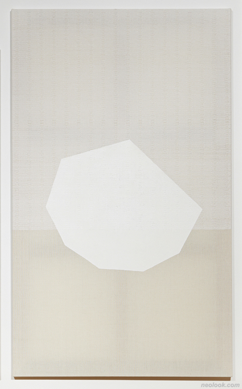
오늘의 새로운 미술가들은, 시대성을 형성하지 못하고 각자의 타임라인을 타고 흐르며 공허로 전화하는 무시간성의 오늘을, 과거의 방식으로 포착-의태하려 애쓰지 않습니다. 오히려 그걸 최적의 형식으로 (헛되이 포착하지 않고) 유의미하게 흘려버릴 수 있도록, 제 작업의 존재 형식을 포스트미디어로 재정의해내려 애쓰고 있죠. 공허에 대응하는 공허의 미디어로 제 작업을 재발명해내지 못하면, 부지불식간에 구시대로 휩쓸려갈 판이거든요. 그렇다면, 차승언의 작업은 어떨까요? ● 차승언은 좁게는 미니멀리즘, 넓게는 추상미술 전반의 유산을 되돌아보며 회화의 현상학적 존재와 그 본질을 탐구합니다. 캔버스의 직조를 통해 ‘회화의 조건을 가시화하는 회화’를 성찰하려는 시도는, 미술사에 전례가 없던 일입니다. 근래의 작업에선, ‘회화의 기저에서 환영과 실재의 차원을 새로이 재구성하겠다’는 야심이 드러나고, 지난 시대의 대가와 그들의 작업에서 느낄 수 있던 어떤 현대적 풍치(風致)마저 감지됩니다. 그것이 비록 의태 혹은 의태의 소산(또는 부작용)일지라도, 그 재연된 ‘즉물적 생생함’엔 묘한 비평적 성격이 있습니다. (비고: 직조 회화/조각으로 참조적 추상미술에 도전하는 이로는 차승언이 단연 돋뵙니다만, 유사동형의 문제의식을 지닌 작가들을 찾는 일은 어렵지 않습니다. 일단, 왕년의 추상미술운동 ‘쉬포르/쉬르파스(Supports/Surfaces)’를 재방문-재구조화하는 추상미술로 두각을 나타낸 다이애나 몰잔[Dianna Molzan, 1972-]을 차승언과 비교해볼 수 있고, 또 종종 캔버스천의 직조 구조를 해체하는 방식을 취하는 가브리엘 피온코우스키[Gabriel Pionkowski, 1970-]도 언급해볼 수 있습니다. 차승언의 초기 작업과 유사한 작업을 전개한 직조 미술가로는 러스 래스키[Ruth Laskey, 1975-]란 인물도 있다고 하네요. 이들 경쟁자 가운데 가장 힘 있는 작가는, 2011년 휘트니미술관에서 개인전을 연 바 있는 다이애나 몰잔입니다.) ● 차승언의 작업이 지니는 특징은, 직조 행위를 참조적 전유(referential appropriation) 삼아, 인용되는 것과 인용하는 주체 사이의 거리를 표지하고, 그를 통해 현상학적 현대성을 의태-갱신해내는데 있습니다. 그의 직조 과정에서 긴요한 것은, 전유하는 약탈자의 자세—이른 바 ‘그림들 세대(Pictures Generation)’의 작업 태도에서 두드러졌던—가 아니라, ‘과거’와 ‘인용된 과거’로부터 적절한 거리를 유지 혹은 확보하는 시공간 감각입니다. 2010년대의 일부 예술가들의 작업에서 발견되는 이러한 참조성(referentiality)을, 포스트모던 시대의 참조성이나, 모더니스트의 자기-참조성(self-referentiality)과 구별 짓는 특징이, 바로 그 2중의 거리감에 있습니다. ● 대표작 「Twill97cmFrame」(2013」은, 캔버스의 표준 프레임 가운데 가로가 97cm인 60F, 80P, 100M, 120M, 이렇게 네 가지 규격을 바탕으로 삼은 첫 두 작업 가운데 하나로, 상단에 120M, 100M, 80P, 60F 크기의 프레임을 세로 방향으로 세운 채 좌에서 우로 아랫선 정렬 배치하고, 그 바로 아래로 다시 60F, 80P, 100M, 120M 크기의 프레임을 역시 좌에서 우로 윗선 정렬 배치한 작업입니다. 기본 골격은 그리 구성됐지만, 각 프레임을 감싸는 직조 캔버스는 60F 크기에 해당하는 130×97cm의 영역만을 트윌(twill) 패턴으로 직조했고, 나머지 부분, 즉 60F 규격의 그리드에서 벗어나는 영역은 위사(가로실)를 비워 경사(세로실)만으로 채웠습니다. 그런데, 직조로 메운 60F 크기의 영역이 모두 60F 크기의 프레임을 재현하므로, 마치 60F 크기의 캔버스가 가로와 세로 4×2로 줄맞춰 반복되고, 다시 그 위아래로 특수 크기의 캔버스를 (화면의 대조와 율동을 위해) 점진하는 형태로 덧붙인 것처럼 뵈기도 합니다. 하지만 더 자세히 고찰하면, 환영을 제시하는 직조 캔버스 뒤로, 그 환영 아닌 환영을 지지하는 실물 프레임이 비쳐 뵈기에, 이는 반환영주의적 환영을 유희하는 사물-회화로 회화의 궁극적 토대를 가시화하는 (메타-역사적) 작품이 됩니다. (직조 부분에서 프레임의 환영을 구성하는 것은 살구색 염색사입니다.) ● 2014년의 개인전 『애그니스와 승환스(Agnes and SeungHwans)』에서 작가는 이러한 작업 방식을 심화·확장했습니다. 신작 「Bright Richard on Honeysuckle 60, 80, 100, 120」(백색 버전)(2014)에서 그는, 다시 한 번 가로가 97cm인 60F, 80P, 100M, 120M, 이렇게 네 가지 규격을 바탕으로 삼았습니다. 인동초 무늬(honeysuckle)로 직조한 연백색의 면사 캔버스는 아랫선 정렬돼있고, 그 표면에 백색의 물감(흰색 젯소와 아크릴 물감[옐로오커]의 혼합)으로 다시 포스트미니멀 미술가인 리처드 터틀(Richard Tuttle)의 작업이 인용(샘플링)돼있습니다. 작가에 따르면, 2013년 6월 런던 테이트 모던에서 직접 촬영한 리처드 터틀의 작업 「8th Paper Octagonal」(1970)을 도상으로 삼되, 시계 방향으로 90도 틀어서 인용했다고 합니다. 작업 과정에서 종이 샘플을 만들고 크기 위치를 임의로 결정했기 때문에, 직조 캔버스 위에 그려진 8각형 형태의 위치와 크기는 모두 제각각입니다.

- 차승언_Plain1and1_면사, 합성사, 직조_146×97×3cm_2014 차승언_Plain2and2_면사, 합성사, 직조_146×97×3cm_2014
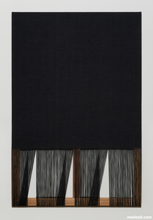
반면, 흑색 버전의 신작 「Brighter Richard on Honeysuckle 60, 80, 100, 120」(2014)은, 같은 캔버스의 구성에 역시 인동초 무늬로 직조한 흑색의 면사 캔버스를 적용한 작품입니다. (직조 방식은 같지만, 실의 구성이 약간 다릅니다. 백색 버전의 경우, 평직조 부분에 20s/4 2줄을 사용하고, 인동초문 직조 부분에 20s/4 2줄+30s/3 1줄을 사용했습니다. 흑색 버전의 경우, 평직조 부분에 20s/4 3줄을 사용하고, 인동초문 직조 부분은 20s/4 3줄+30s/3 1줄을 사용했습니다. [고로, 직조 된 부분의 밀도가 달라서 스트레처가 비치는 정도가 다릅니다.]) 표면에 리처드 터틀의 8각형을 인용(샘플링)한 방식도 같습니다만, 역시 흑색의 물감(검정 젯소와 아크릴 물감[카본블랙]의 혼합)을 이용했습니다. ● 위 두 작업에서 차승언은 저만의 방식으로 리처드 터틀이란 역사적 대상을 재방문하고 재구성해 새로운 추상의 동적 공간을 창출하고 있는 셈입니다. 2010년대의 작가와 20세기의 미술사 사이에 접면(interface)을 재구성하고 그에 특정성을 부여했다고, 아니, 2010년대의 작가와 20세기의 미술사 사이에 특정성으로 부여하는 방식으로 접면을 재직조함으로써 저만의 동적 공간을 확보해냈다고 볼 수 있습니다. ● 반면, 선긋기로 추상의 일가를 이룬 화가, 애그니스 마틴(Agnes Martin)을 참조적 대상으로 삼은 작업들은, 방식이 조금 다릅니다. 예를 들어, 「Crossing Herringbone 1, 2」(2014)는, 61×46×2cm의 스트레처에 맞춰 헤링본 무늬를 직조하되, 그것을 규칙적으로 유지하지 않고 (애그니스 마틴이) 드로잉하듯이 임의 변형해 회화적 유기성을 화면에 부여한 작품입니다. 그런데, 하단부의 일부분의 직조를 마치지 않고 비워둔 다음, 세로 방향의 경사 일부를 오른쪽으로 이동시켜 놓았습니다. 덕분에 스트레처와 벽면이 부분 노출됐죠. 그러니까, 애그니스 마틴은 구체적 작업으로 인용(샘플링)되지 않고, 작업 태도와 방식으로 참조된 모습입니다. ● 사실 근작 가운데 가장 드라마틱한 것은 캔버스 작업 석 점을 경첩으로 연결해 조각적 작업으로 발전시킨 「One Thing-1(등산복 123)」(2014)과 「One Thing-2」(2014)입니다. 「One Thing-1(등산복123)」에서 작가는, 경사에 (염색하지 않은 면사 외에) 분홍색으로 염색한 실을 일부 배치하고, 다시 위사에 분홍색으로 염색한 실을 일부 적용해 스트레처의 구조를 환영적으로 재현-중첩하고, 일부 구간에 털수세미 제작에 사용되는 분홍색의 반짝거리는 합성사를 넣은 뒤, 삼면의 캔버스가 서로 연결되는 두 구간은 완성되지 않은 경사를 늘어뜨리는 방식으로 구성해, 안쪽 구조가 들여다뵈도록 꾸몄습니다. 공중에 매달린 이 구조체는, 회화인 동시에 조각/설치가 되는 양상을 보여준다는 면에서 더 흥미롭습니다. 표리일치를 향했던 미니멀리즘 회화/조각의 이상을 기이한 방식으로 융합-구현해놓은 꼴이죠. ‘등산복 123’이란 부제는 뭐냐구요? 그건 작가가 경기창작센터의 입주 작가로 활동하면서 겪은 일을 지시합니다. 언젠가 대부도에 위치한 경기창작센터에 들어가는 버스인 123번을 탔는데, 뒷좌석에 앉은 아주머니 다섯 분이 모두 화려한 핑크색 등산복을 입고 계시더라나요. (「One Thing-2」는 같은 구성의 작업인데, 검정색 버전입니다. 경사와 위사 모두에 검정색 실 외에 회색으로 염색된 실을 사용해 스트레처의 구조를 재현-중첩하고 있습니다.) ● 그렇다면, 왜 2014년 개인전의 제목은 『애그니스와 승환스(Agnes and SeungHwans)』였을까요? ‘애그니스’ 쪽은 설명이 됐지만, ‘승환스’는 아리송합니다. 분명히 작가의 이름을 변형한 것일 텐데요. 이우환의 이름과 제 이름을 융합한 것일까요? 아니면 김환기? 역사적 융복합체로서의 제 작업을 ‘승환스’라는 유비적 이름으로 간접 해설해본 게 아닐까 합니다.

- 차승언_One thing-1(등산복123)_실, 염료, 나무프레임_220×146×146cm_2014 차승언_Tent-7_면사, 염료, 아크릴물감, 천막_194×194×3cm_2013
흥미로운 점이 하나 더 있습니다. 과거 추상미술의 역사에서 여성들은 하위주체의 위치에 처해있었습니다. 조앤 미첼, 애그니스 마틴, 앤 트루이트 등 예외적인 작가들이 있었습니다만, 주류는 아니었죠. 반면, 오늘의 참조적 추상미술의 흐름에서 주류의 위치를 점한 것은 여성들입니다. (제리 살츠의 배우자이기도 한 뉴욕타임즈의 기자/평론가 로버타 스미스는 이 점을 청신호로 지적한 바 있습니다. 뉴욕 현대미술관에서 열린 『영원한 현재: 무시간적 세상의 당대회화』전의 작가 17인 가운데 아홉이 여성이고, 한 명을 제외하면 전부 연장자의 위치에 있다는 거죠. 그는 젊은 작가들이 거의 남자로 구성된 것을 덜 신나는 사실로 꼽았습니다만, 글쎄요, 해당 계보에서 개척자 세대의 주요 작가가 주로 여자라는 사실은, ‘여성적 권위’의 성립을 뜻하는 게 아닐까요. 기타 자세한 사항은 그의 기사 “The Paintbrush in the Digital Era”[The New York Times, DEC. 11, 2014]를 참고하세요.) 몇 해 전, 남녀차별주의자인 화가 게오르크 바젤리츠는, ‘회화는 근본적으로 남근성을 띠기 때문에 남들 앞에 나서서 제 주장을 펼치는 일에 심리적 부담을 느끼는 여성들에게 본질적으로 불리하다’고 주장한 바 있습니다. 그는 대형 회화가 남자에게 유리한 매체라고 확언했습니다. 굉장히 듣기 싫지만, 어느 정도 일리가 있는 소리죠. 그러면, 어가 참조적 추상미술의 흐름에서 남자들은 주도권을 잃었을까요? ● 역시 참조적 추상미술에서 핵심은, 독창적 (비)이미지와 그를 야기하는 돌출적 붓질에 있는 게 아닌 겁니다. 화면을 구성하는 표면적 요소들은 스킨을 구성할 따름입니다. 이제 중요한 것은, 매체의 재창안과 재발명을 통해 참조 대상들과 나 자신을 연관 짓는 섬세한 재맥락화의 감각입니다. 쉽게 말해, 좀비-추상의 새로움은 조형적 요소들에 있지 않고, 그것들을 연결 짓는 특유의 유기적 메타-프로토콜에 있습니다. 그러니, 남자보다 여자가 더 두각을 나타낼 수 있는 게죠. 차승언의 직조 행위의 앞날도, 그래서 더 기대해볼만 합니다. 타자와 자신을 연관 짓는 여성 우위의 관계 감각과 소통 능력이, 참조적 직조 행위를 거쳐, 메타 차원의 맥락을 어떻게 더 재직조-포섭해낼는지 알 수 없거든요. (전후 한국의 추상미술이 거둔 성취를 참조 대상으로 삼기 시작할 때, 비로소 작가는 최전성기에 돌입할 것으로 예상됩니다.) ■ 임범묵 AKA 이정우 AKA 임근준

- 차승언_Agnes and Seunghwans展_살롱 드 에이치_2014
The Situation Awareness of Zombie-Modernism: A Comprehensive Path to Cha Seungean's Weaving Practice ● Since the financial crisis of 2008, contemporary art is undergoing fundamental transformation. There is a big transition in terms of how art is defined in society and artists approach their work. How should we explain this? ● Contemporary art has quietly reached its denouement. Some may still refuse to acknowledge this, but the age of contemporary art is completely over now. Gone are the days of wild partying in the great ruins of modernism. Now we are left to face the desolate and superflat world filled with fragments of non-history/meta-epic. There are many who are still confused, but I will tell you again—the age of “contemporary art” is all over. Period. ● Gone are the days of using the metaphors from the plateaus to reflect on the history of mankind—except for perhaps some esoteric exegetical studies. Modified modernism supports social and cultural foundation in establishment. However, its spirit is neither modern nor contemporary. For people living in 2015, contemporareneousness does not exist any more. Each one is living their own time, that is all. As a result, primitiveness that has been suppressed in the name of contemporaneity is resurfacing in every aspects of our lives. This trend will intensify, in my view. ● If you look at the reality of establishment such as art museums, universities, exhibitions, artists and art critics, you will see that the socio-cultural protocols that pervade each area are still grounded on modernism. What sustains the art world is modified modernism that has lost its identity and been reverted to convention. In terms of external appearance, it looks the same as before. Therefore, it will be very difficult for you to detect the troublesome changes and their implications unless you examine the situation very carefully. An ideology that has lost its soul and only maintains its body—I call this a zombie ideology. Furthermore, I call the period since 2008 where postmodern problem consciousness has disappeared the age of zombie modernism or the zombified, dead age. ● One of the characteristic symptoms of zombie-modern age is decline in or disappearance of in fetishism of image-object or object-image. In the past, it was possible to accumulate-reinforce fetishism via repetition of analog images. However, in today’s world of the Internet connected by smart devices, repetition-exposure of images leader to undermining of fetishism. Therefore, the future is gloomy for the postmodern artist generation who has been using a mimesis strategy and worked on constructing fetishism of commodity. Their time will never come back again. ● Images, both in the world of the Internet connected by smart devices and the reality remediated by this world, are only information that can be searched and manipulated. Therefore, they lose the power of overwhelming the audience and degenerate into a tamed signifiers. It does not stop at damaging the fetishism of 2D images. A wide spread of low-priced 3D printers is damaging the fetishism of 3D objects as well. It is not just because 3D printer has obviated the difficulty of labor. The reason why, unlike in the past, 3D works appear like an image is because they are 3D rendition of objects based on computer graphics. That is, they are an output of multi-angle mapping images. That 3D objects can be converted into image information makes it no longer possible to attribute the same level of fetishism to them as before. ● Endowing 2D or 3D images with the new reality of “information/data” neutralizes their fetishism. Borrowing from J. David Bolter & Richard Grusin, we can say the following: As hypermediacy dimension is transformed into a combination of visibly additional information that can be touched during re-mediation of images, fetishism of object-image/image-object that used to be reinforced by transparent immediacy is deconstructed/exhausted. (Note: The fact or feeling of a particular data or information can be controled by touch means much more than just accessibility). ● In the age of declining and vanishing of fetishism, a new generation modern artists and designers who handle images/non-images starts by reformulating the way they perceive reality. What is most important for them is to acknowledge that “The 20th century that refuses to die has now become an unalterable database of decision-making and freedom that governs the lives of almost all of us.” ● The 20th century that keeps coming back to us with high definition images and information is the template that shackles mankind of the 21st century. The present that has prematurely lost its future (probably sometime during the 1980s) confronts a danger of losing its ground to the past that seems to possess more vibrancy. I am confident that the power that overwhelms and drives mankind in the present period of 2010s is not in “the new“ but “the old” - including the history of the 20th century contemporary art. This new “the old” is the record/database of the 20th century that refuses to fade into tradition. It is the new world that will dominate the space (and people who live in it) of the 21st century that has become superflat. ● Robert Hughes explained the essence of the 20th century culture and art in terms of the “shock of the new” (cultural/artistic response of mankind). The 21st century, the age of lowered expectation, which has just begun, could be explained in terms of the “shock of the old (that refuses to fade away)” (and cultural and artistic response, or non-response, of mankind). If so, as of today, in 2015, what are some of the meaningful responses made by artists? ● In 2008, a new breed of abstract artists appeared simultaneously, primarily from the United States. (Of course, many had been exploring abstract art long before but was noticed only after 2008). There are too many of them so that it is difficult to list them in categories. Their styles vary. However, what is common among them is they all revisit certain subject matters in abstract art that were dealt with in the past and reconstruct them. One of the characteristic trends in the new abstract art is a tendency to recombine panting and sculpting by treating 2D images as 3D and vice versa. ● The trend has already been summarized in the critical works of various size. It was Bob Nickas, art critic and curator, who first summarized the new trend in abstract art. His book Painting Abstraction: New Elements in Abstract Painting (Phaeton Press, 2009) was well received for encompassing 80 artists of the new trend for last five years. However, the book failed to touch upon the core essence from critical perspective. The first publication that really succeeded in setting a critical direction was Contemporary Painting in Context (Museum Tusculanum Press, 2010) by Anne Ring Petersen, Mikkel Bogh, Hans Dam Christensen and Peter Norgaard Larsen. Although the book failed to garner raving review against the backdrop of dramatic decline in meta-theory, it did provide much inspiration and stimulus to artists who have been pursuing similar artistic endeavors: Peter Weibel’s (media theorist/curator) critical reflection on paintings of the 1990s; Barry Schwabsky’s (art journalist/art critic) philosophy on ontology of painting; and the work analysis of Katharina Grosse, a pioneer in new abstract painting. ● There were many exhibitions in art museums too. The Paint Things: Beyond the Stretcher exhibition held in DeCordova Sculpture Park and Museum (January 27, 2012 – April 21, 2013) was a great opportunity to see a new trend in abstract art that is expanding into space as it is interpreted as 3D object. It was the work of Dina Deitsch, the museum curator and Evan Garza, a visiting curator. (Exhibiting artists: Claire Ashley, Katie Bell, Sarah Braman, Sarah Cain, Alex Da Corte, Cheryl Donegan, Franklin Evans, Kate Gilmore, Alex Hubbard, James Hyde, Sean Kennedy, Wilson Lawrence, Steve Locke, Analia Saban, Allison Schulnik, Jessica Stockholder, Mika Tajima, Summer Wheat. Among them, the artists who were commissioned for new original works were: Katie Bell, Sarah Cain, Franklin Evans, Kate Gilmore) ● On the other hand, In Transit: Between Image and Object (January 25, 2014 – January 4, 2015) exhibition held in MASS MoCA was a smaller scale exhibition with the theme of “Physical Movement vs Virtual Movement,” which contemplated a relationship between space being transformed into images and corresponding 3D images. The exhibiting artists were Dike Blair, Hugh Scott-Douglas and Guyton/Walker duo. Amazingly, the curator was a graduate students at Williams College majoring in art history, Robert Wainstein. It was an exception event because an internship program designed to give students a curator experience ended up eclipsing the museum exhibition. ● However, the most talked-about exhibition was The Forever Now: Contemporary Painting in an Atemporal World held at New York MoMA (December 14, 2014 – April 5, 2015). The exhibition was planned by curator Laura Hoptman who had moved to the MoMA from the New Museum in 2010. It was an ambition exhibition consisting for 17 artists with the theme of atemporality, tracing a new trend in abstract painting in history. The new curator categorized the characteristics of the new abstract painters in terms of reanimation, reenactment and sampling. Furthermore, she tried to discover a creative archetype for their works. (Participating artists: Richard Aldrich, Joe Bradley, Kerstin Brätsch, Matt Connors, Michaela Eichwald, Nicole Eisenman, Mark Grotjahn, Charline von Heyl, Rashid Johnson, Julie Mehretu, Dianna Molzan, Oscar Murillo, Laura Owens, Amy Sillman, Josh Smith, Mary Weatherford and Michael Williams). ● However, the exhibition, instead of rave review, found itself at the center of severe criticism from art critics. In particular, Jerry Saltz, an art critic who had been calling the new trend in abstract art “crapstraction following the aesthetics of Tumbler,” criticized the exhibition for having succumbed to the taste of art market based on groundless accusations. (Walter Robinson, an art critic, calls similar art works in new abstract art Zombie Formalism. It is in a negative context, of course.) Jerry Saltz is a professional art critic with a long and enduring career in the field. However, he belongs to the old school and seems to find it difficult to detect new visual style of zombie-modern generation. After all, it is not an easy thing to understand an artistic motivation to reconstruct the history of abstract art in the 20th century and capture the virtual fetishism from the point of view of “omnipotent smart phone” that encompasses the Internet world connected by smartphones as well as the virtual world remediated by such world. The essence of the 2010s is loftiness of nihilism and virtual loftiness deposited in today’s abstract art. It is not a value you can reject or underestimate just because you hate it. ● When postmodernism and corresponding contemporary art emerged for the first time in the mid to late 1970s, the cronies of post-war modern art did not spare efforts to attack the contemporary art by saying that “This is not an art.” Art collectors like Giuseppe Panza even stopped collecting art works. Objects-image or image-objects that can be controlled using signs was the basic unit that moved the age of contemporary art. The fact had remained unchanged from the 1970s until 2008. However, from today’s “omnipotent smartphone perspective,” the images in the world are a moving target in time. If we capture it using the time-honored duty of art, its meta-image becomes a blank space, vanishing without an explanation and leaving only an empty signifier. (Print-photograph-artists who had been using typological methodology therefore encountered an unexpected bankruptcy. Their time will never return.) ● Accordingly, the new artists of today do not expend efforts to capture/imitate today’s world of atemporality that cannot form contemporaniety but is transformed into emptiness over individual timeline using the method of the past. On the contrary, they try to redefine the ontology of their art work in terms of post-media so that it can flow in a meaningful way under optimal form rather than trying to capture it in vain. The situation is that, if you can’t redefine your work to use nihilistic media to respond to nihilism, you will end up flushing away into the olde school without even knowing. If so, how about the works of Cha Seungean? ● Cha Seungean, reflecting on minimalism in a narrower sense and the overall heritage of abstract art in a broader perspective, explores the phenomenology of painting and its essence. An attempt at making a “panting that visualizes the condition that makes painting” by weaving a canvas is unprecedented in art history. In her recent works, she shows an ambition to “reconstruct anew hallucination and reality in painting,” from which is detected modern elegance that was felt only the masters of the past and their works. Even if they are imitations or the fruits of imitations (or side-effects), there is a strange critical aspect to the reconstruction that is “realistically vivid.” ● Note: Although Cha Seungean outstands among those who use weaving painting/sculpture to challenge creative abstract art, it is not too difficult to find artists who share similar artistic approaches in their art. First, we can compare Cha Seungean to Dianna Molzan (1972- ) who is distinguishing herself in abstract art by revisiting-reconstructing Supporters/Surfaces, a movement in abstract art of the past. Also, we can consider Gabriel Pionkowski (1970- ) who often deconstructs the weaving structure of canvas fabric. For weaving artist who is doing works similar to the early works of Cha, we can think of Ruth Laskey (1975- ). The most influential among them is Dianna Molzan, who held a personal exhibition at the Whitney Art Museum in 2011. ● The characteristics of Cha Seungean is in using weaving as referential appropriation to indicate the distance between the object being quoted and the subject that is quoting and, through this, imitate-update phenomological modernity. What is crucial in her weaving process is not the predatory attitude for exclusive possession, which was distinguished in the attitude of Pictures Generation of the past, but a spatial-temporal sense that secures and maintains appropriate distance between the “past” and “the quoted past.” The unique characteristics that distinguishes referentiality found in some artists during the 2010s from referentiality of the postmodern era or self-referentiality of the modern artists is in that sense of dual distance. ● One of her well known work Twill97cmFrame (2013) is one of her first two works based on the four sizes of 60F, 80P, 100M and 120M with the horizontal length of 97cm among the standard canvas frames. The frame by the size of 120M, 100M, 80P and 60F was stood in a vertical direction in the upper area and the bottom line was arranged from left to right. Then, right below it, the frame in the size of 60F, 80P, 100M and 120M was arranged from left to right in the upper line. This was how the basic frame was constructed. However, the weaving canvas that enveloped each frame was weaved in twill pattern only for 130cm x 97cm area, which corresponded to the size 60F. The rest, i.e., the area outside the size 60F grid, was emptied of vertical thread and weaved only with horizontal thread. However, since the fully weaved 60F size area realizes all 60F size frame, the work appears as if 60F size canvas repeats in 4x2 line (HxV) and, below it, a special size canvases (for contrast and rhythm on the screen) were progressively attached. On closer inspection, on the other hand, since the actual frame that supports hallucination, not hallucination itself, is seen through behind the weaved canvas that suggests hallucination, it is an object-painting that parodies anti-hallucination and therefore is a work that visualizes the ultimate basis of painting (meta-historical). (What constructs the frame’s hallucination in weaving work is the apricot color dyed thread.) ● In her personal exhibition Agnes and SeungHwans in 2014, the artist intensified and expanded such method. In her new work Bright Richard on Honeysuckle 60, 80, 100, 120 (White Version, 2014), she used again the four frames with the size of 60F, 80P, 100M, 120M with the vertical length of 97cm. A light yellow color cotton canvas weaved in a honeysuckle pattern was arranged at the bottom line. Then, white color paint was used on the surface (the mix of white Gesso and acrylic paint [yellow ochre]) to quote (sampling) the work of Richard Tuttle, a post-minimalist artist. According to the artist, while using Richard Tuttle’s 8th Paper Octagonal (1970) as a prototype, which she filmed herself in the Tate’s Modern Museum in London in June, 2013, she rotated the work 90 degree, clockwise to quote the work. Since she created a paper sample during work process and arbitrarily decided on sizes and locations, the location and size of the octagonal shape painted on the weaving canvas all vary. ● On the other hand, to the new black and white version work Brighter Richard on Honeysuckle 60, 80, 100, 120 (2014), a black cotton canvas weaved in honeysuckle pattern based on the same canvas structure was applied. The weaving method is same, but the composition of threads is different. In the white color version, two 20s/4 threads were used for the plainly weaved area while two 20s/4 threads+ one 30s/3 thread was used on the honeysuckle-pattern weaved area. In the black color version, three 20s/4 threads were used for the plainly weaved area while three 20s/4 threads+ one 30s/3 thread was used on the honeysuckle-pattern weaved area. [Therefore, the density of the weaved area is different, which makes the degree of see-through of a stretcher different]. The way Richard Turttle’s octagonal shape was quoted (sampling) on the surface is also same. However, black color paint (the mix of black Gesso and acrylic paint [carbon black]) was used. ● In the two of her works above, Cha Seung Ean used her own method to revisit and reconstruct a historical object called Richard Turttle, thus creating a dynamic space for new abstract art. It could be viewed that she reconstructed the interface between the artists of the 2010s and the history of art in the 20th century and gave it a unique expression. One could go further and say that she secured her own unique dynamic space by re-weaving the interface by endowing uniqueness to the relationship between the artist of the 2010s and the history of art in the 20th century. ● On the other hand, the works that referenced Agnes Martin, an artist who used line drawings to create her own artistic world in abstract art, are a little different in terms of methodology used. For example, Crossing Herringbone 1, 2 (2014) was weaved using the herring bone pattern in a 61x46x2 cm stretcher. However, the work chose not to maintain the regularity but was changed as if applying free-drawing, thus endowing the screen with painting quality. However, weaving at the bottom part was partially left unfinished and the vertical thread in the vertical direction was moved to the right side. Due to this, the stretcher and the wall surface were partially exposed. That is, Agnes Martin was not quoted (sampling) using specific works but was referenced by her attitude and methods in her work. ● In fact, the most dramatic among the recent works are One Thing-1 (Hiking Cloths 123 (2014) and One Thing-2 (2014), which connected three canvas works to develop them into sculptures. ● In One Thing-1 (Hiking Clothes 123), the artist partially placed pink-dyed threads for vertical threads (excluding undyed cotton) and applied the pink-dyed threads on top of the vertical thread to reconstruct-reiterate the structure of a stretcher in dreamy images. Then, she inserted pink sparkling synthetic sand used for fur scrub brush in certain sections and hung unfinished vertical threads in two sections where the three faces of canvas are connected. This way, the structure of the inside can be seen from the outside. This structure, hung in the space, is interesting because it is both painting and sculpture/installation at the same time. It fused and integrated the ideal of the minimalism that sought internal/external consistency in a strange way. What does the subtitle Hiking Clothes 123 mean? This has to do with the experience of the artist during residency at Gyeonggi Creation Center. One day, she took a number 123 bus that was going to Daebu Island. In the bus, she found three old women wearing flash pink color hiking clothes. (One Thing-2 is the work that has the same structure, but it is a black color version. Black and grey color-dyed threads were used for both vertical and horizontal threads to recreate-reiterate the structure of a stretcher). ● Now, why did she call the title of her 2014 personal exhibition Agnes and SeungHwans? Agnes part was explained above. However, I still don’t know about SeungHwans parts. It certainly is the variation of her own name. Perhaps her name was combined with another name, Lee WooHwan? Or Kim HwanGi? My guess is that she tried to explain the corpus of her works as historical fusion-combination in “SeungHwans,” the name analogous to her own. ● There is one more interesting thing. In the past, women were placed in the lower hierarchy in the history of abstract art. There were Joan Mitchell, Agnes Martin, Ann Trudy and other exceptional female artists, for sure. However, they were not in the mainstream. On the other hand, it is women who have taken the mainstream position in the referential abstract art today. (Roberta Smith, a New York Times reporter and art critic and spouse of Jerry Saltz and, considered this a good sign). Among the 17 artists exhibited in The Forever Now: Contemporary Painting in an Atemporal World held in New York MoMA, 9 of them were women and everyone except one was old. She found it less exciting to find out that most young artists were male. Well, come to think again, doesn’t the fact that the pioneering artists in a given field mainly consisted of women mean establishment of “female authority?” (For more details, please refer to The Paintbrush in the Digital Era (The New York Times, DEC. 11, 2014)) A few years ago, a sexist artist Georg Baselitz claimed that “Painting is fundamentally phallic in nature. Therefore, it is fundamentally in disfavor of women who feel psychological pressure in presenting their opinions.” He proclaimed that a large-scale painting was a medium that favored men at a fundamental level. I hate to hear this, but he has a point. Then, how did men end up losing a leadership in referential abstract art trend? ● After all, the essence of referential abstract art is not in the originality of (non) images and the impulsive brush strokes that represents it. What is crucial instead is refined sense of re-contextualization that connects an artist to the object of references via re-creation and re-invention of medium. This is why women led men in this field. This is why we can expect more from weaving of Cha Seung Ean in the future. We do not know how women’s ability to relate and communicate that determines one’s relationship to others, the ability that women hold superiority over men, can re-weave-collect meta-level contexts through referential weaving. (My prediction is that when the artist begins to reference the achievement in abstract art in post-war Korea, she will have entered her prime as an artist.) ■ Chungwoo Lee a.k.a. Geun-jun Lim
Vol.20141127h | 차승언展 / CHASEUNGEAN / 車昇彦 / weaving.painting