- ● homepage
- ● archives
- ● restoration
- ● books
- ● big banners
- ● post board
- ■ neo's search
- ■ about us
- ■ 게재방법 안내
- 개인정보처리방침
- [email protected]
- Tel. 02_335_7922
- Fax. 02_335_7929
- 10:00am~04:30pm
- 월요일~금요일
- 3/3(월) 대체공휴일

공동작품 COLLABORATIONS
구경숙+이안하비展 / KOOKYUNGSOOK+IAN HARVEY / painting 2012_0914 ▶ 2012_0927 / 월요일 휴관
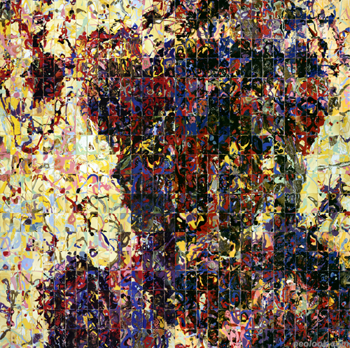
- 구경숙+이안하비_Figure 11 (Head)_에나멜, 셸락, 폴리우레탄, 안료_160×152cm_2012
● 위 이미지를 클릭하면 네오룩 아카이브 Vol.20080328f | 구경숙+이안 하비展으로 갑니다.
초대일시 / 2012_0914_금요일_06:00pm
후원 / California State University_Sacramento, CA
관람시간 / 11:00am~06:00pm / 월요일 휴관
쿤스트독 갤러리 KunstDoc Gallery 서울 종로구 창성동 122-9번지 Tel. +82.2.722.8897 www.kunstdoc.com
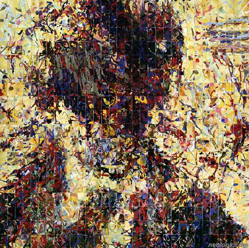
구경숙과 이안하비에게 공동작업은 제조된 혼돈으로부터 질서를 끌어내는 것이다. 이안하비의 작업은 마치 지각변동을 저속촬영한 듯한 프로세스 지향적인 추상회화인 반면 구경숙은 여성적 이슈를 조명한 유기물의 조각작업과 사진 인화지에 감광액을 이용해 자신의 몸을 찍어내어 작업한다. 두 작가는 공동작업에서 자신들의 예술적 감성을 결합시켜 벽크기의 회화작업을 제작하였다. 작품을 형성하는 고도의 회화적 기술은 작업의 주제인 인간존재의 심오함을 아름답게 표현해낸다. 그들의 공동작업 중 가장 큰 작품은 명함용 카드에 그려진 2000장이 넘는 그림들로 이루어져 있다. 각각의 카드에 셀락, 에나멜, 폴리우레탄, 흑연, 그리고 합성 혹은 천연의 다양한 안료들로 조합된 용액들을 담고, 뿌리고, 분무하여 구성물 간의 상대적 무게와 점도에 따라 반응하도록 하였다. 그 결과물은 마치 우주, 지진, 홍수, 화상분출, 별의 분화, 혹은 폭풍처럼 번지는 불과 같은 지상학적 이벤트를 보는 듯 하다.

- 구경숙+이안하비_Figure 11 (Head)_에나멜, 셸락, 폴리우레탄, 안료_160×152cm_2012_부분

- 구경숙+이안하비_Figure 12 (Head)_에나멜, 셸락, 폴리우레탄, 안료_160×152cm_2012
그들의 공동작업에서 가장 먼저 주목하게 되는 것은 색채이다. 빨강, 파랑, 그리고 거의 사이키델릭에 가까운 강렬한 빛깔의 핑크와 더불어 우리가 생각해 낼 수 있는 중간적 색조 는 모두 포함하고 있다. 질감은 무광의 투박함에서 고광택까지 자유롭게 배회하며, 특히 가장 창백하고, 거칠고, 부식된 듯한 부분은 쟝 뒤뷔페(Jean Dubuffet)의 작품「여체(Corps de Dame)」에서 보이는 형태와 표면질감을 상기시킨다. 이것은 진정 최고조의 표현에 달한 거침없는 작업이라 할 수 있다. 구경숙과 이안하비는 작품의 재료가 지닌 고유한 물성에 최대한의 자유를 부여함으로써 그들이 원하는대로 흐르고 응결하도록 어떠한 제어도 하지 않는다. 그들은 각각의 카드를 붓질로 간주하며 이점은 척 클로스의 초상화를 구성하는 회화적 요소와 유사하다 하겠다. 그러나 척 클로스가 사진의 음영적 가치를 현실적으로 모의하기 위해 작은 추상형의 "세포들"을 그린 반면, 구경숙과 이안하비는 색감과 질감의 양극 사이에서, 조심스럽고도 정밀한 줄다리기를 하듯, 각각의 카드를 배열하고 재배열하며 작품을 제작한다. 작가의 표현에 따르면 주로 재료를 컨트롤 할 수 없어 불편할 때에 예상치 못한, 언어를 넘어선, 새로운 표현가능성을 발견하게 된다고 한다. 기념비적인 크기의 공동작품은 화면 중심에 단독의 인체이미지를 보인다. 들쑥날쑥, 균형을 잃은, 화면 가득 침투한 인체이미지는 마치 불과 같은 격동적인 사건에 휩싸인 것처럼 보인다. 몸으로 직접 찍어내지는 않았지만 인체형태의 윤곽은 케롤리 쉬니만(Carolee Schneemann)에서 트레이시 에민(Tracy Emin)에 이르는 바디아트의 최근역사를 상기시킨다. 그러나 이들의 공동작품은 전형적인 바디아트(이브 클라인 (Yves Kline) 의 작품「인체측정학(anthropometries)」을 반영한 듯한 구경숙 자신의 작품을 포함하여)에서 주로 다루는 '성' 혹은 '성적 역활'을 주제로 하지 않으며 대신 인체에 대한 그 외의 크고 작은 사유들을 주제로 한다.
- 구경숙+이안하비_Figure 13 (Head)_에나멜, 셸락, 폴리우레탄, 안료_160×152cm_2012

- 구경숙_Markings_디지털 프린트_140×138cm×5_2012
- 구경숙_Markings 11-11_디지털 프린트_140×138cm_2012
본인은 구경숙과 이안하비가 1980년대 중후반에 안젤름 키퍼(Anselm Kiefer)가 지난 세기 나치의 과오를 대변하고자 까맣게 타버린 대지와 잔해들을 표현한 불로 그슬린 흙페인팅과 동일한 영역에 도달하였다고 본다. (만약 최악의 예언이 사실화 된다면 세계는 또 다른 재앙에 빠질 수 있다.)「Figure 5」와「Figure 6」을 그외에 어떻게 달리 해석할 수 있겠는가? 입체파처럼 보이다가 곧 사라져 버리는 직사각형 위에 청-흑색의 광란한 선들과 검은 그림자의 인체는 마치 인간재앙의 화신처럼 보인다. 이러한 해석이 유일하게 약화되는 경우는 작가가 지나치게 색상에 빠질 때라고 하겠다. 한 예로 구경숙과 이안하비가 거의 형광빛의 분홍색으로 인체를 크고 뚜렷하게 구분한「Figure 7」은 결과적으로 키치미술의 경계선 상에 놓여있다. 하지만 그러한 실수도 결국 그들의 공동작업이 성공하는 경우 매우 독특하고 독자적이며 강렬할 수 있지만 한편으론 이러한 위험부담도 지니고 있는 대담한 시도임을 인지하게 한다는 점에서 유익하다 하겠다. (스퀘어실린더, 2010년 2월) ■ 데이빗 엠. 로스
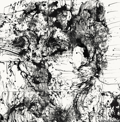
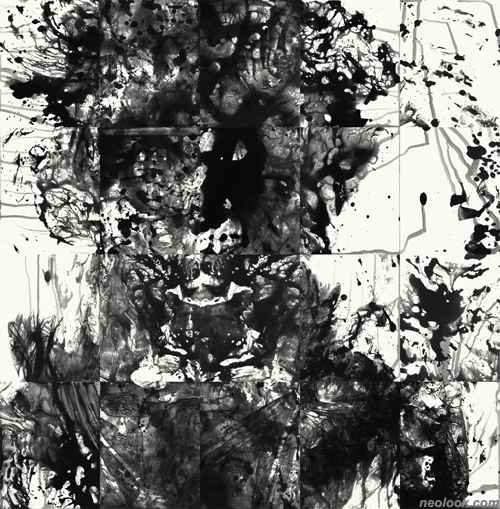
본 전시에는 구경숙의 최근 디지털프린트 연작인「Markings 2011」도 함께 선보인다. 「Markings 2011」은 인체의 두상을 표현한 것으로 몸의 물리적 삶을 조명한 이전의 작업과는 달리 마음과 감정을 다루는 내면적 삶에 초점을 두었다. 작가는 비닐봉지를 머리에 쓰고 감광액을 이용해 인화지 위에 즉흥적인 그림을 수백장 그려낸 뒤 이 중 20장의 그림을 선택하여 각각의 두상을 제작하였다. 그리드로 연결되어 뚜렷한 성격을 드러내는 각각의 두상은 남성 혹은 여성, 사악함 혹은 선함, 흥겨움 혹은 두려움 등 서로 다른 성격을 띄고 있으나 결국 하루에도 수없이 변하는 인간내면의 자화상이라 하겠다.
- 구경숙_Markings 11-6_디지털 프린트_140×138cm_2012
For Ian Harvey and his wife Koo Kyung Sook, collaboration is about wresting order out of manufactured chaos. Harvey specializes in process-oriented abstract paintings that look like time-lapse images of geological events; Koo creates imprints of her body on emulsion-coated photo paper, along with sculptures made of organic matter that address gender issues specific to Korea, her birthplace. In their collaborative works, the artists fuse both sensibilities in wall-sized montages that are as much about virtuoso paint handling as they are about the human condition. The artists' largest collaborative works consist of more than 2,000 individual paintings executed on card stock, each unit the size of a standard business card. The cards are dipped, poured and sprayed with combinations of shellac, enamel, polyurethane, graphite, and various synthetic and organic pigments that are then allowed to interact and recombine according to their relative weights and viscosities. The resulting forms mimic cosmic, seismic and meteorological events: floods, volcanic eruptions, starbursts, firestorms and the like. ● The first things you notice about these works are their colors. They include every neutral shade you can think of, along with reds, yellows, blues and pinks in hues so saturated they border on psychedelic. Textures roam from porous and ashen to high-gloss, and recall in their palest, roughest, most caustic spots, the shapes and surfaces of Jean Dubuffet's Corps de Dame. This is full-throttle painting at its maximally expressive. Harvey and Koo hold back nothing; they give full vent to the intrinsic properties of their materials and allow them to flow and congeal as they please. The artists regard the individual cards as brushstrokes, each akin to the pictorial elements in Chuck Close's portraits. But where Close paints small, abstract "cells" to realistically simulate the tonal values of photographs, Harvey and Koo compose by arranging and rearranging the individual cards in what amounts to a carefully calibrated tug-o-war between extremes of value and texture. "More often than not," the artists state, "it is in the uncomfortable moments when it is not possible to control the materials that we discover unexpected expressive possibilities and new layers of content." Each picture in these montages features a single, centrally located figure. Ragged, off-balance and shot-through, it appears to be fleeing (or engulfed) in some fiery, cataclysmic event. While not physically imprinted, the outlines of the human forms invoke the recent history of body art, from Carolee Schneemann to Tracy Emin; but unlike so much of that legacy (including Koo's own works which echo the "anthropometries" of Yves Kline), these pictures aren't about gender roles or sex; they are about everything else — things that are both smaller and larger. ● Harvey and Koo, I believe, have crossed into the same territory that Anselm Kiefer staked out in his scorched Earth paintings of the mid and late 1980s, the ones in which charred fields and Nazi ruins stand in for all that went wrong in the last century (and may well go wrong again if dire predictions come to pass.) How else can we view pictures like Figure 5 and Figure 6? With their green-black cast, frenzied lines sliced into cubist rectangles and fugitive, blackened shadow-figures, they seem to be the very picture of human calamity. The only thing that might undercut this interpretation is the artists' occasional slip into over-the-top coloration. In Figure 7, for example, where Harvey and Koo use a swath of hot pink to define the figure, the result is borderline kitsch. Still, such missteps can be instructive: they give us an inside look into the high-wire act that makes this kind of painting so risky — and so powerful when it succeeds. (SQUARECYLINDER.com, February 5, 2010) ■ David Roth The exhibition also includes Koo Kyung Sook's most recent series of digital prints titled, Markings 2011. This new project focuses on the head and physiognomy. In this series the point of view has shifted away from the physical life of the body to the interior life of the mind and the emotions. Koo used a plastic bag to cover her head and draw hundreds of improvised "drawings" with developer on photography paper. Each head is constructed by selecting 20 "drawings" that, when joined together, form a distinct physiognomy. The heads reveal unique personalities, woman or a man, old or young, wicked or good, playful or fearful. Ultimately, they are portraits of our ever-changing internal lives.
Vol.20120914a | 구경숙+이안하비展 / KOOKYUNGSOOK+IAN HARVEY / painting