- ● homepage
- ● archives
- ● restoration
- ● books
- ● big banners
- ● post board
- ■ neo's search
- ■ about us
- ■ 게재방법 안내
- 개인정보처리방침
- [email protected]
- Tel. 02_335_7922
- Fax. 02_335_7929
- 10:00am~04:30pm
- 월요일~금요일
- 3/3(월) 대체공휴일

꽃 그리고 바다 Flowers and Sea
강승현展 / KANGSEUNGHYUN / 姜承賢 / painting 2011_0919 ▶ 2011_0930 / 일요일 휴관
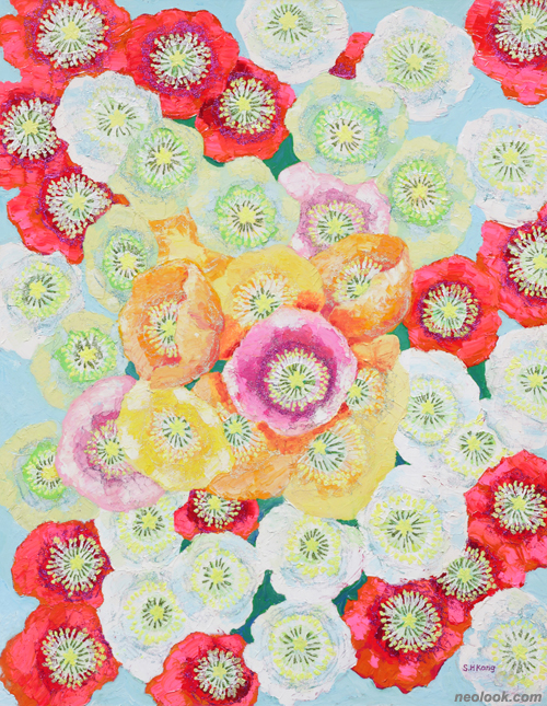
- 강승현_축제 Festival_캔버스에 유채_91×65cm_2011
초대일시 / 2011_0919_월요일_05:00pm
기획 / 비전아트갤러리
관람시간 / 10:00am~07:00pm / 토요일_10:00am~06:00pm / 일요일 휴관
비전아트갤러리 Vision Art Gallery 서울 강남구 청담동 118-17번지 네이처포엠 빌딩 B103 Tel. +82.2.511.2227 www.visionartgallery.co.kr
소박한 마음이 낳은 그림들 ● 최근에 강승현이 즐겨 다루는 소재는 카라꽃과 서양 양귀비꽃이다. 카라꽃은 희고 서양 양귀비꽃은 화려하다. 이 두 종류의 꽃을 어떻게 표현하느냐 하는 점이 최근 그가 기울이는 관심사인 것 같다. 일견, 대상을 화폭에 옮기는데 있어서 그는 대상에게서 받은 인상보다는 그것의 특징을 어떻게 화면에 조형화하느냐 하는 점에 착안하고 있다. 이 말은 그의 작품이 형태에 대한 재현보다는 화면 안에서의 구성에 보다 큰 비중을 두고 있다는 것을 뜻한다. 형태의 단순화, 화려하고 밝은 색상, 화면 내에서의 질서 추구와 같은 그의 관심사들은 따라서 소박하면서도 천진난만한 작품을 낳고 있다.
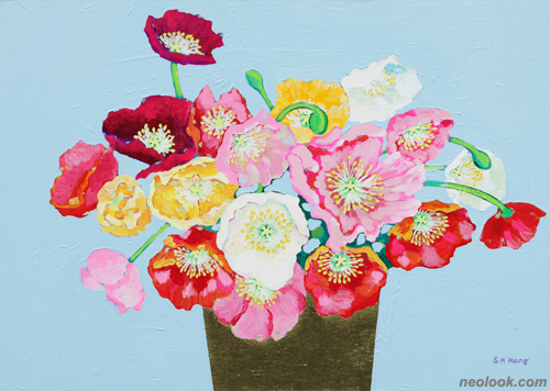
- 강승현_아마폴라2 Amapola 2_캔버스에 아크릴채색_65×91cm_2011
나는 이러한 작품의 특징들이 어디에서 기인하는가 하는 점을 찾다가 한 점의 풍경화를 주목하게 되었다. 그것은 바다를 그린 풍경화였는데 아주 매력이 넘쳤다. 화면의 2/3는 바다고 나머지 1/3은 하늘을 그린 그 그림은 얼핏 평범한 풍경화처럼 보였다. 그러나 자세히 바라보니 바다가 주는 평온한 느낌을 그 특유의 감각으로 잘 표현한 그림이었다. 이 작품은 강승현의 회화적 재능을 잘 집약하고 있는데, 무엇보다 꾸밈이 없는 것이 장점이다. 바다의 짙은 청색과 그림의 상단부 거의 전체를 차지하는 흰 구름, 그리고 화면의 왼쪽에 약간 모습을 드러낸 육지를 그린 이 그림은 얼핏 보면 바다 풍경을 그린 평범한 풍경화로 인식될 것이다. 그러나 이 그림에서는 그림을 잘 그려야겠다는 화가의 욕심이 엿보이지 않는다. 그냥 무심히 그린 듯한 어떤 소박한 마음이 잘 드러나 있다.

- 강승현_바다1 Sea 1_캔버스에 아크릴채색_39×52cm_2010
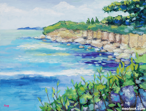
- 강승현_바다2 Sea 2_캔버스에 아크릴채색_50×65.5cm_2010
꾸밈이 없는 것, 즉 소박하게 있는 그대로를 드러내는 것만큼 화가에게 중요한 덕목은 없다. 그 이유는 대상에 대한 투명한 시선이야말로 회화적 진실에 육박해 들어갈 수 있는 힘이기 때문이다. 그림에 있어서 기교는 따라서 어느 정도 필요한 필요조건일 뿐 충분조건은 아니다. 이 점이 내가 장차 화가로서의 강승현에게 기대하는 부분이다. 그렇다면 이제까지 그가 시도해 온 추상과 구상, 혹은 이 두 요소가 혼재된 실험을 잘 종합하여 보다 분명한 자신의 화풍을 개척, 정립해야 할 것이다. 물론 보다 유연한 사고를 가질 것을 곁들여 주문하고 싶다.

- 강승현_카라2 Callas 2_캔버스에 아크릴채색_45×65cm_2010
카라꽃을 소재로 다루고 이를 회화적으로 표현하는데 있어서 강승현은 서양 양귀비꽃과는 다른 기법을 사용하고 있다. 우선 카라꽃의 표현에는 단순화의 원리가 적용되고 있다. 대상의 윤곽선을 검은색으로 처리한 것, 그리하여 카라꽃의 순백색과 선명한 대비를 이루게 한 것이 그것이다. 꽃과 잎사귀에 가해진 붓의 터치는 말끔하게 다져 화면을 더욱 단순화하는데 일조하고 있다. 이 카라꽃을 소재로 한 그림들이 그 안에 기하학적 추상의 요소를 내재한 것이라면, 그 반대로 서양 양귀비꽃을 그린 그림들은 유기적인 형태미를 보여주고 있어 대조적이다. 색상 또한 꽃의 성격에 맞게 화려하며 명랑, 쾌활한 느낌을 주고 있다. 그리하여 전체적으로 볼 때 이 두 종류의 꽃은 강승현의 회화를 설명할 수 있는 몇 개의 키워드를 제공해 준다. 즉, 단순과 복잡, 소박과 화려, 기하학적 형태미와 유기적 형태미 등등이 그것이다.

- 강승현_글리터 카라_Glitering callas_캔버스에 아크릴채색_65×50cm_2010
따라서 이 두 쌍의 대비적인 관계를 실제의 소재를 통해 어떻게 구현해 나갈 것인가 하는 점이 앞으로 한 사람의 화가로서 강승현이 풀어가야 할 숙제인 것 같다. 어찌 보면 화가란 대상을 그저 눈에 보이는 대로 옮기는 사람이 아니라 그것을 통해 새로운 회화적 진실을 발견하는 자일 것이다. 그러할 때 그 마음이 천진하고 소박해야 함을 두 말할 나위가 없다. 다행스럽게도 강승현에게는 그런 마음과 눈이 있는 것 같다. 많은 화가들이 회화적 기교와 세련에 빠져 있는 요즈음의 화단 풍토에서 이런 강승현과 같은 작가를 발견하는 것 또한 나의 즐거움 가운데 하나이다. ■ 윤진섭
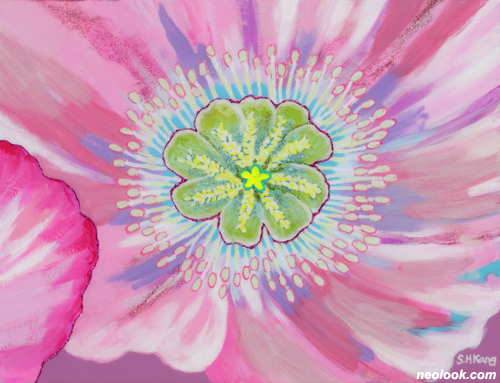
- 강승현_화심 Blossom_캔버스에 아크릴채색_50×65cm_2010
Pictures Born out of Simplicity of Mind ● Callas and Western poppies are favorite subject matters of Seung-hyun Kang's latest work. While callas are dazzlingly white, poppies are so fanciful. In dealing with these, the artist seems to focus mainly on how to represent these two flowers. In other words, it is not the impression but the distinct features of the two kinds of flowers that the artist is concerned with. Thus, more emphasis is placed on the overall composition than on faithful representation. Such formal elements as simplified forms, splendid colors, and orderly compositions make the work simple yet ingenuous. ● The artist's trade style goes back to the landscape that I took notice of. It was a very attractive seascape. At a first glance, it was just a simple seascape in which the picture plane is divided into 2/3 of the sea and 1/3 of the sky. However, at a closer look, I found that tranquility of a sea was well rendered by the artist's own unique sensibility. The work exemplified Seung-hyun Kang's artistic talent and most of all, the artist's forte, simplicity. Like typical seascapes, the work consists of a blue sea, white clouds filling most of the top, and a piece of far-away land at the left corner. However, it didn't show any painterly greed, which revealed simplicity of the artist's mind, as if the work was made casually. ● Keeping a work simple, not adorning it, is one of the most important artistic virtues. That's because a transparent gaze empowers an artist to reach painterly truth, which makes technical skills in painting somewhat necessary but not sufficient enough to become a true artist. That's what I exactly expect from Seung-hyun. My advice to the artist is to review all the works including figurative, abstract, and other experimental works in order to consolidate a unique personal style and to have more flexibility in thinking. ● In representing the flowers, the artist uses two different representational methods. Callas are abstracted as shown in the stark contrast of white callas and black outlines. Neat and solid brushwork on petals and leaves also contribute to simplicity. While callas are represented geometrically, Western poppies are rendered organically. Their colors are fancy, vivid, and lively. Some key words can describe the artist's style exemplified by the two flowers. That is, simplicity vs. complexity, humbleness vs. fanciness, geometric beauty vs. organic beauty, and so on. ● How a subject matter is materialized with these two opposite elements? This can pose a challenge for Seung-hyun Kang. In the end, artists are not those who meticulously imitate objects but those who find out a new painterly truth through them. And it is needless to say that artists should have innocent eyes and simplicity of mind when they see. Fortunately, Seung-hyun Kang has already the mindset and eyes. In the current artistic climate that is so into painterly sophistication and techniques, discovering an artist like Seung-hyun Kang is one of my pleasures of being a critic. ■ Jin-sup Yun
Vol.20110919b | 강승현展 / KANGSEUNGHYUN / 姜承賢 / painting