- ● homepage
- ● archives
- ● restoration
- ● books
- ● big banners
- ● post board
- ■ neo's search
- ■ about us
- ■ 게재방법 안내
- 개인정보처리방침
- [email protected]
- Tel. 02_335_7922
- Fax. 02_335_7929
- 10:00am~04:30pm
- 월요일~금요일
- 3/3(월) 대체공휴일

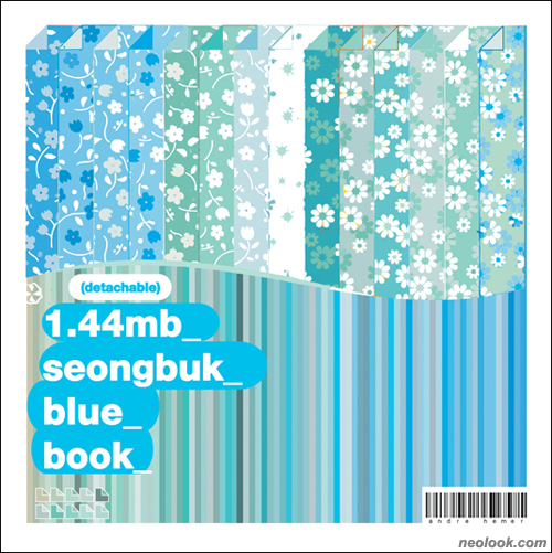
drawing 15. 1.44mb 성북 블루 1.44mb Seongbuk Blue
안드레 헤머展 / Andre Hemer / mixed media.installation 2009_0925 ▶ 2009_1023

- 안드레 헤머_'1.44mb 성북 블루 북'_42장의 깃발, 설치_2009_성북동 서울 Andre Hemer_'1.44mb Seongbuk Blue'_42 printed flags, Installation_2009_Seongbuk-dong. Seoul, Korea
초대일시_2009_0925_금요일_08:00pm "1.44mb 성북 북 디저트"
관람시간 / 11:00am~11:00pm
테이크아웃드로잉_TAKEOUT DRAWING 서울 성북구 성북동 97-31번지 Tel. +82.2.745.9731 www.takeoutdrawing.com
예술이든 일상 생활에 있어서든 사물을 좀더 명확하게 이해하게 해주는 문화적 직접체험이란 것이 있다. 외국인으로서 성북동에서 전시를 한다는 것은 어떤 면에서 보면 바로 그런 경험이었다. 물론 좀더 모호한 그러나 동시에 매우 중요한 문화적 이동으로부터 오는 지식도 있다. 일상 생활에서 우리는 잘 알려진 그리고 친숙한 문화적인 것들을 많이 보게 되지만, 그 장소가 이국적이면 이국적일수록 문화적 배경이나 그와 관련된 것들에 대해 알아채기는 어렵다. 그러나 그런 문화적 관련성 없이도 볼 수 있는 아이디어, 그냥 바깥에서부터 바라봄으로써 느낄 수 있는 어떤 힘이란 것도 있다. 아마도 이것은 또 다른 종류의 문화적 지식이 될 수도 있고, 성북동에서 나의 현대미술 작업 '1.44mb 성북 블루'도 이와 같은 것이라 할 수 있다. ● 동시대의 지식의 공급과 이동은 성북동, 테이크아웃드로잉에서의 프로젝트의 많은 부분을 차지한다. 이번 프로젝트는 한국작가 장석준과 안드레 헤머가 직접적 체험인 오프라인 사진 이미지로부터 추출한 성북동의 시각적 아카이브와 인터넷 서치 엔진' 구글'에서 따온 간접적인 온라인 상의 이미지를 데이터베이스로 사용한 공동 작업이다. 1.44mb 아카이브 머신으로부터 '색상'만을 사용함으로써 나만의 작업과정을 새롭게 시도할 수 있는 색상 팔레트를 조합할 수 있었다.
- 안드레 헤머_'1.44mb 성북 블루 북'-표지_Limited Edition Artist Book_2009 Andre Hemer_'1.44mb Seongbuk Blue Book'_Limited Edition Artist Book_2009

- 안드레 헤머_'1.44mb 성북 블루 북'-세부_Limited Edition Artist Book_2009 Andre Hemer_'1.44mb Seongbuk Blue Book'_Limited Edition Artist Book_2009
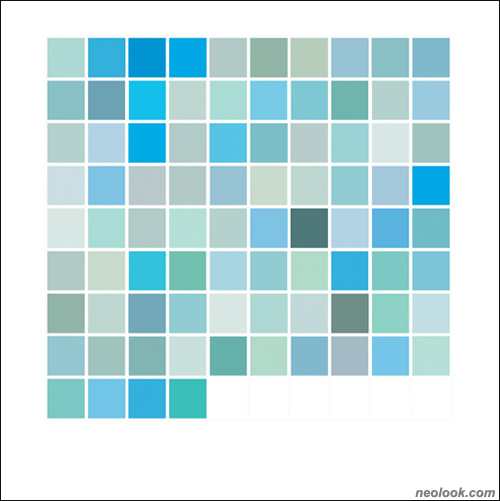
성북동에는 어떤 것 자체가 특이해서가 아니라 평범함에서 나오는 일종의 신비로움 때문에 두드러져 보이는 것들이 많이 있다. 다른 숫자면 충분했을 텐데 왜 특정 색상을 사용했을까 에 대한 호기심이 내가 컬러샘플로 선택한 이미지들이다. 때로는 이 선택들이 객관적인 이론적 근거가 되었으며 반면 주관적인 시각이 되기도 했다. ● 성북동의 파란색 팔레트의 색상들은 모두 장소와 연관이 있다. -항상 그것들이 문화적 근거로 인한 것이기 보다는, 지역의 건물구조와 경관, 그리고 간접적으로 구글에서 볼 수 있는 색상들에서 왔다. 어떤 것은 옛 집들의 기와 장식에서 온 밝은 녹색의 파란색일수도 있다. 어떤 것은 건물의 색상일수도 있고 좀더 간단한 밝은 색 파란 사인일수도, 개인이 손수 칠한 어찌 보면 개인적 성향이 강한 집 대문 일수도 있다. 이 이미지들은 개인이 마주치게 되는 심각한 상황부터 호텔 광고같이 피상적인 것까지 두루 있다. 이 아카이브의 사용은 일종의 진실을 나타낸다. - 1.44mb 성북 블루 프로젝트에 고유하게 있는-. 그것은 나 자신이 성북동 팔레트라고 생각하는 일종의 행위와 같이 문화적 진실을 알리는 아이디어 이다. 많은 진실들이 각각 서로 반복되기도 하고 어떤것은 상반되기도 하며 존재한다. ● 팔레트의 각각의 색상은 내가 관심이 가는 이미지의 일정색상을 CMYK 컬러의 형태로 저장한 이미지로부터 따왔다. 1.44mb 성북 블루 팔레트는 그래서 개인적인 선택인 동시에 더 넓게는 문화적 역사적인 사실도 가지고 있다. 이 색상들은 퍼블릭 프로젝트 기간 중에는 팔레트 색상의 순서대로 84개의 단색 깃발로 성북동 거리에 걸렸다(주: 한성대 입구부터 테이크아웃드로잉까지 1k) 이것은 일시적인 디지털 이미지가 실제로 존재하는 시각적 물질적 형태로 바뀌는 것이었다. 이런 작업은 이 색상이 어디서부터 왔고 1.44mb 성북 블루 자체가 무엇을 의미하느냐에 대한 질문들을 야기했다.
- 안드레 헤머_'1.44mb 성북 블루 북'-세부_Limited Edition Artist Book_2009 Andre Hemer_'1.44mb Seongbuk Blue Book'_Limited Edition Artist Book_2009

- 안드레 헤머_'1.44mb 성북 블루 북'-세부_Limited Edition Artist Book_2009 Andre Hemer_'1.44mb Seongbuk Blue Book'_Limited Edition Artist Book_2009
'성북 블루' 북에서 색상들이 다시 등장한다. 이것은 퍼블릭 프로젝트에서 일종의 공상, 허구와 같이 보이는 심미적인 -마치 아이들의 장난감 같이 보이는 재미있게 놓여져 있는 84개의 색상들을 보여준다. '성북 블루' 북의 형태는 성북동 여행해서 본, 그곳에 있는 동네 문방구, 그러니까 신식 카페나 조경프로젝트 옆에 있는 오래된 문방구에 기인한다. 문방구 밖에는 오래된 장난감 뽑기 기계가 있고, 낡은 빛 바랜 포스터들이 있었다. 문방구는 아이들의 장난감, 문구들을 소소하게 파는 곳이지만 일종의 옛 것 같은 느낌, 작고 소소한 생활 같은 것을 느꼈다. 나는 종종 그 문방구에서 몇 개의 색종이들을 샀다. -그 색종이들은 사실 미적 감각을 지닌, 좀더 심미적인 것을 만들 수 있는 한국의 생산품임에도 불구하고, 보통은 약간은 조잡하구 유치한 것들 이었다-. 외형은 여러 가지 이미지와 색상을 가지고 있지만, 기능은 책이라기 보다는 사용하고, 뜯어서 다 소비해버릴 수 있는 그런 형태의 책' 색종이'이다. ● 이런 종류의 색종이는 사실 성북동 만의 것은 결코 아니다. 서울의 시장이나 대형서점에서 쉽게 구할 수 있는 것들이다. 그래서 이렇게 새로운 방식의 색종이를 만든다는 것의 의미는 그 출처를 어디서 구했는가에 더 의미를 둔다. 사회적, 문화적 변화에도 여전히 존재하는 그런 소소한 가게, 문방구가 있다는 것을 일깨워 주는 것 말이다. 이 색종이들은 자연으로부터 상징되는 색을 미학적으로 표현한 가장 단순하고 이해하기 쉬운 오브제이다. ● '성북 블루' 북은 뜯어 쓸 수 있는 종이에 84가지 색상의 CMYK 팔레트로 구성되어 있는 매우 특별한 아트 프로젝트의 기록이라고 할 수 있다. 어떤 것이 다른 것보다 더 중요하다는 의미는 없다. 모든 것들이 그 의도에서 동일하게 중요하다. ● 이 전시의 중요성과 힘은 여러 요소들의 복합적 사용에 있다. 각각의 요소가 상호작용과 질문의 수단, 기구라고 할 수 있으며 드로잉과 구조 그리고 앞으로도 더 채워갈......미완성의 이야기라고 할 수 있다. ■ 안드레 헤머

- 안드레 헤머_'1.44mb 성북 블루(erased)'_리넨에 아크릴_30×30cm_2009 안드레 헤머_'1.44mb 성북 블루'_리넨에 아크릴_30×30cm_2009 Andre Hemer_'1.44mb Seongbuk Blue (erased)'_acrylic on linen_30×30cm_2009 Andre Hemer_'1.44mb Seongbuk Blue'_acrylic on linen_30×30cm_2009

- 안드레 헤머_'1.44mb 성북 블루'_2009 Andre Hemer_'1.44mb Seongbuk Blue'_2009
In both art and everyday life there is a first-hand cultural knowledge that can often provide an account of things more clearly. As a foreign bystander undertaking an exhibition in Seongbuk-dong (Seoul, Korea) the way in which I was able to experience the district was without much of this knowledge. Of course, there is also the knowledge that comes from cultural removal- a more distant and ambiguous type yet important all the same. In day to day life we are confronted with cultural markings that can be both known and familiar. The more foreign the place, the less familiar the cultural context and associated markings become. There is a certain power that comes from looking from the outside; the idea that things can be viewed without their usual cultural association and perhaps can be reclaimed into a different kind of cultural knowledge. Much like my contemporary painting practice the work made for the 1.44mb Seongbuk Blue took this position. ● The supply and transfer of knowledge in contemporary life informed much of the Takeout Drawing project in Seongbuk-dong- in which a collaborative project with Korean artist Jang Sukjoon yielded a visual archive of Seongbuk sourced from first-hand 'offline' photographic images, and second-hand 'online' images taken from the internet search engine Google. Using colour sampled directly from the images found in the 1.44mb Archive Machine I was able to assemble a colour palette which could feed back into my own art processes. ● In Seongbuk there are many things that stand out not because of their extraordinary nature, but because of the mystery inherent in the banal. The mystery of why a particular colour is used when any number could suffice is what draws me to the images that I chose to sample. Sometimes these choices lead to an objective rationale, while others remain as subjective oddities in the Seongbuk visual landscape. ● The colours that I claimed for the Seongbuk Blue palette are all inherently linked to the place- not always through a kind of cultural truth, but through the independent interventions of the local population upon the architecture and visual landscape of the area, and the images that result from the second-hand images that Google allows us to view. Some interventions are linked- such as the over-painting of light teal-blues around the roof trim of old houses. By all accounts this blue has a purpose- to give the impression of a patina façade as would have originally been the case in such a building. Other cases are less tangible or are simply of a particular moment- an image found in Google of a demonstrating man holding up a bright blue sign, or a hand-painted doorway speaking of a kind of personalised kitsch taste. In every case the images are found in the archive- and relate to the finite knowledge that the archive of the 1024 images held. The images range from the serious enquiry of personal encounters to the superficiality of hotel advertising. The use of the archive represents a kind of truth- one that is inherent in the 1.44mb Seongbuk Blue project. It is the idea of claiming a cultural truth- in this instance it is the act of me claiming a Seongbuk palette. Many truths exist- each one overlapping and contradicting another. ● Each colour in the palette was sampled from an image- where a colour section of the image that interested me was saved as a CMYK colour. The resulting 1.44mb Seongbuk Blue palette can be seen as holding personal inflections, choices and controls, as well as broader cultural and historical truths. ● These colours were placed back into Seongbuk-dong during the public project that lined the main thoroughfare- with all eighty-four colours presented as a palette-ordered set of monochromatic flags. The idea of transferring the colours to a physical outcome in public space ran in parallel to the 1.44mb floppy disks constituting the 1.44mb Archive Machine exhibition- where ephemeral digital images were transferred into the form of something material. This was very much about returning the colour palette to the physical and visual source. It proposed to ask questions about the source of the colour, but also as an act of truth itself- this is 1.44mb Seongbuk Blue. Within the artist book the colours appear again, and an account of the public project is also captured but in an aesthetic that brings the work back to a kind of fiction- eighty-four colours, playfully taking the guise of a children's play-thing. ● The form of the artist book came from one of my daily trips to Seongbuk, and one of old local businesses (a type of shop called Moonbanggu문방구) seemingly out-of-place alongside the new cafes and council landscaping projects that are coming to slowly surround its location. Outside were well-used toy vending machines whilst the windows were filled with sun-faded posters which had probably held that position for a great many years. Moonbanggu shops sell low price children's toys, stationary, and oddities- nothing of great value, but the sentiment is of a time past- and a humble kind of life bound by the simplicity of selling and living within one space. I often walked out with a handful of 'detachable colour paper books'- an item that despite the manufacturer's Korean origins has the aesthetic possibility of a more universal interaction- complete with sentiment and kitsch. The interface was through colour and image, and its function was not as a finished book but as a consumable item of detachable parts. ● This kind of item is by no means native to Seongbuk-dong- indeed it is a product easily obtainable in markets and large book shops alike in Seoul. So the sentiment of creating the artist book comes more from the source of where it was bought- a reminder of those shops existence in a time of large social and cultural change in the area. In this project the artist book has significance for the sentiment that it holds- the enduring nature of such an object and the most simple and understandable of aesthetic appearances. ● The artist book is comprised of a CMYK palette of eighty-four colours on detachable papers. It is also a record of a very specific artist project. One is not more than the other- they are both equal in their intention. The potential for the entire exhibition lies in the multiplicity of its use. Each element is vehicle for interaction and question. It's a story half-finished, with constructions and drawings still to come… ■ Andre Hemer
Vol.20091002f | 안드레 헤머展 / Andre Hemer / mixed media.installation