- ● homepage
- ● archives
- ● restoration
- ● books
- ● big banners
- ● post board
- ■ neo's search
- ■ about us
- ■ 게재방법 안내
- 개인정보처리방침
- [email protected]
- Tel. 02_335_7922
- Fax. 02_335_7929
- 10:00am~04:30pm
- 월요일~금요일
- 3/3(월) 대체공휴일

EREHWON-YIM TAE KYU
임태규展 / YIMTAEKYU / 任泰奎 / painting 2009_0509 ▶ 2009_0720 / 월요일 휴관

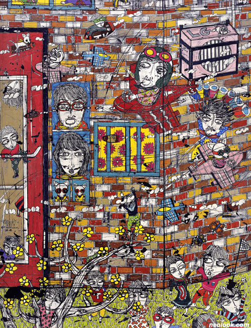
- 임태규_erehwon_ART SEASONS Beijing_2009
● 위 이미지를 클릭하면 네오룩 아카이브 Vol.20080413f | 임태규展으로 갑니다.
초대일시_2009_0509_토요일_03:00pm
관람시간 / 11:00am~07:00pm / 월요일 휴관
ART SEASONS Beijing 798 Art District, No. 2, Jiu Xian Qiao Road, 706 North 3rd Street Chaoyang District, Beijing100015, China Tel. +86.10.5978.9850 www.artseasonsgallery.com
폭주세대의 귀향 ● 임태규의 그림에선 일러스트의 냄새가 짙게 풍긴다. 그의 화면에서 쏟아져 나오는 직설적이면서도 우화적인 메시지, 종이라는 재료 위의 단순한 색채 배열과 필치에서 나오는 속도감 때문이다. 그것이 그의 한계이자 장점이 된다. ● 기본적으로 일러스트는 그리려고 하는 대상의 원인에 귀속되기 보다는 그려진 그 대상이 자아내는 효과에 집중되도록 되어 있다. 관객에게 정보의 전달력을 높이려는 목적을 어느 정도 지니고 있는 것이 사실이다. 그렇기 때문에 일러스트는 그것이 방출하는 정보 이외의 깊고 넓은 파장을 만들기 힘들어 진다. 또한 개념의 직접적인 노출로 인해 '날 것' 같은 생각들의 기록이 되기 쉽다. 내러티브적인 성격이 강하다. 그러므로 일러스트는 이미지로 기록된 작가의 문학적 관념들이라 할 수 있다.
- 임태규_erehwon_한지에 먹, 채색_138×173cm_2009_부분
임태규의 그림은 그가 오랫동안 관심을 갖고 있던 온갖 비행하고, 부유하고, 갈등하고, 파고들고, 엿보고, 폭주하는 '주변인'이라는 틀 밖의 존재들에 대해 써내려간 그림일기와도 같은 것이다. 항상 화면 밖으로 탈출하려는 그들은 얼마 후면 폭발할 것 같은 금기된 무언가를 품고 있다. 그들의 비행(飛行)이 이 세상으로부터의 도피인지, 아니면 저 세상으로의 탐험인지 명확히 알 수는 없으나 각종 동식물을 포함하여 황룡, 인어, UFO까지 등장시키는 그의 화면을 찬찬히 들여다보면, 그가 지구라는 땅 위의 족속들, 그 중에서도 '주변'이 아닌 '중심'을 차지하고 있는 '권력자'들에 대한 은근한 항의를 표현하고 있음을 느낄 수 있다. "우리도 우리들끼리 낄낄대면서 깔쭉대면서 우리의 대열을 이루며 한 세상 떼어 메고 이 세상 밖 어디론가 날아갔으면" 하던 황지우의 「새들도 세상을 뜨는 구나」라는 시의 한 구절이 떠오르게 된다.

- 임태규_woman&woman#10_한지에 먹, 채색_173×138cm_2009
때문에 임태규의 화면이 일견 장식적이고 가볍게 보일 수 있겠지만 그 내면은 매우 사회적이며 풍자적이다. 리오타르가 『포스트모던의 조건』에서 '거대담론'의 전체를 부인하고 '소담론'의 파편을 중시했던 것처럼, 임태규는 개인 심리의 내면으로 들어가 사적인 일상의 소재들을 사용하면서 자기 나름대로의 꿈을 풀어 놓는다고 할 수 있겠다.

- 임태규_fly away home #22_한지에 먹, 채색_138×173cm_2009
그런데 여기서 우리가 주목해야할 또 하나의 지점은, 그가 그만의 스토리를 표현하는 방식이다. 우선 그의 모든 그림들에서 느낄 수 있는 일관성은 그의 색채 활용에서 비롯되는 데 그의 팔레트는 전통적인 동양화의 안료를 사용하면서도 가장 기본적인 서양의 3원색의 틀을 크게 벗어나고 있지 않다는 것이 특징이다. 파랑(초록), 노랑(황금), 빨강(분홍)의 조합은 르네상스의 보티첼리의 배색을 연상시키기도 한다. 또한 임태규는 이런 색채의 화려함을 극대화시키기 어려운 한지를 고집하고 있는데, 먹물이 젖어 있는 종이 위에 한지를 겹치고 연필을 통해 필선을 그음으로써 뒤에서부터 배어나오는 먹선을 형태의 윤곽선으로 처리하고 있다. 배채(背彩)가 아닌 배묘(背描)라고 할 수 있는 이런 묘법을 사용하니 필선의 맛과 색채의 발현이 이질적으로 드러나는 것이 아니라, 선과 색채 모두 한 면의 종이 위에 균등한 가치의 색채로서 살아남게 되는 화면을 구성하게 된다. 선은 가장 좁아진 색면(色面)인 것이다. 그것은 한지가 갖고 있는 중성적이면서도 중간자적인 성격을 잘 활용한 예라고 할 수 있겠다.

- 임태규_erehwon_한지에 먹, 채색_138×173cm_2008
이렇듯 서양적이라 할 수 있는 소재와 내용을 동양적인 기법과 방식으로 담아냄으로써 임태규는 수묵화와 채색화라는 폐쇄적인 이분법의 구조 속에 질식되었던 동양화에 생동감을 불어넣으려는 시도를 한다. 강력한 위계질서를 여전히 과시하는 동양화단에서 어느 경향이라고 규정지을 수 없는 자신만의 화풍을 시도하면서 결국은 전통적인 동양화의 가장 중요한 특성이라고 할 수 있는 정신성의 표현 문제, 즉 사신(寫神)을 자신의 그림의 중요한 화두로 삼고 있는 것이다. 그의 화면 속에서 부드러운 모필로 남겨진 문향(文香)을 느끼기는 힘들지만 마치 날카로운 펜촉으로 새겨진 동판화처럼 대중적이면서도 강인한 인상을 남겨준다. 그의 이미지나 캐릭터들이 어느 정도 도식화되고 도상화되고 있는 것은 그것들이 하나의 문자-텍스트처럼 소통의 확산을 적극적으로 원하고 있다는 사실을 입증해준다.

- 임태규_Day by Day #3_한지에 먹, 채색_138×173cm_2008
임태규는 이번 전시에서 그의 대표적인 연작이라고 할 수 있는 「fly away home」를 마무리짓는듯한 최신작 「에레혼(erehwon)」을 발표한다. 영국의 시인 새뮤얼 버틀러의 소설 제목이기도 한 「에레혼」은 '어딘지 모르는 곳'을 뜻하는 'nowhere'의 철자를 거꾸로 붙인 것으로 이상향(utopia)을 의미하는 것이라 한다. 나는 어릴적 "nowhere"라는 단어를 처음 접했을 때 그것을 "노우훼어(no-where)"로 읽어야 할지 "나우히어(now-here)"로 읽어야할지 고민했던 적이 있었다. 철자 하나 차이로 그것은 극단적인 거리감을 조성하는 신비로운 단어였다. 임태규의 「에레혼」은 이런 현실과 초현실의 거리를 좁혀나가는 과정으로 여겨진다. 자기의 터전을 떠나 날아가 버렸던(fly away home) 임태규의 자아가 이제는 '지금 여기'의 공간으로 귀환한 것일까. 그의 수많은 분신들이, 자신이 머무를 큰집(topia)의 안과 밖을 출몰하며 기쁨의 춤을 추고 있다. ■ 이건수
- 임태규_Day Dreaming_한지에 먹, 채색_173×138cm_2008
The Homecoming of Speed-Maniacs ● Yim Tae Kyu's works are redolent of illustrative elements. One reason is that the messages, straightforward and allegorical, gush from the pictorial plane. He commands a simple chromatic composition on the medium of paper. Lastly, there is a sense of speed issuing from the brush strokes. The illustrative streak in his works becomes both a limit and an advantage. ● The illustration is supposed to focus more on the effect of what has been drawn, rather than on the cause of it. Its purpose is certainly, to some extent, to enhance the flow of information towards the audience. Due to this, it is difficult to add a wider and deeper wave of meaning to illustration, other than that of direct pictorial offspring. The purpose also tends to be a record of 'possible' thoughts that might have been triggered by an exposure to certain concepts. It is strongly narrative too. Therefore, illustration can be defined as literary ideas recorded in images. ● Yim's works are similar to a picture diary, where he writes away about his own long-standing interests, the 'marginal men', who live on the outside of the boundary. They fly, float, wrestle with anguish, dig up into the blanket, peep with curiosity, and speed about crazily. Yim's marginal men want to get out of the plane, and they look as if they are hatching up something forbidden, waiting to burst sooner or later. It is not completely clear whether you should regard their flight as an act of escape from this world, or as an exploration into the unknown. His characters are composed of all sorts of life; animal, plants, a yellow dragon, a mermaid, and even a UFO. With close observation, you can feel that there is subtle protest against the authorities that are at the 'centre' of society, far from the 'margin'. It reminds you of a few lines from Hwang Ji-woo's Even Birds Leave this World: I wish we could fly away to a distant somewhere Giggling and fooling about In a procession of our own Slinging a piece of the world over the shoulders… This aspect makes the inside of Yim's works into something societal and allegorical too, though they might look decorative and light-hearted. J.F. Lyotard denied the totality of the Grand Narrative and gave credit to the fragmentation of micro-narratives instead(The Postmodern condition : A Report on Knowledge (1979)) Likewise, Yim Tae Kyu unravels dreams of his own, making use of personal and mundane motifs, while delving into the innermost individual psyche. ● Another important realm that should be brought to our notice is the way he expresses his story. What is consistent throughout his work is the chromatic application of employing and blending of three primary colours, with which the artist does not go far beyond. Yim Tae Kyu uses traditional oriental pigment, but he keeps a Western palette. The combination of blue (green), yellow (gold), and red (pink) is reminiscent of Botticelli's color-palette during the Renaissance. Even though it is difficult to work with, the artist persists in using traditional Korean paper, hanji, which is efficacious in magnifying the exuberance of his colors. Yim basically draws lines on the paper with a pencil, which has another layer of paper, soaked with ink, lying underneath. By doing this, the ink from the wet paper permeates to the top layer of paper, bringing the drawing lines into novel visibility. This unique technique results in the transfusion of drawing lines(In traditional painting, before paper was used, people drew on silk. It was not only because silk was so fine and thin, but also so as to create a more mystifying and soothing effect, that they painted on the back of the silk. It allowed the paint to diffuse through the translucent material and soften the originally hard colours; it was an important technique during these times to evoke the inner state of soul, something that was shadowy and not quite distinct. Yim adopted this technique to his works.), to coin a term. Realization of lines and colours does not clash with each other, and there is no heterogeneousness between the two. Such drawing technique brings together the flavour of lines and the charm of colours, and both of them remain alive with equal vibrancy on the pictorial plane. Yim seems to have set up a fine example for making the best use of the quality of hanji - neutral and mediating. ● Portraying contents and motifs that can be considered as western by using means, techniques and methods that are oriental: Yim Tae Kyu attempts to imbue liveliness into the oriental painting, which distinctly creates a dichotomy between a black-and-white painting and a coloured painting. The divisive structure excludes each other, and it divests oriental paintings of breathing flexibility. The world of oriental paintings still proudly boasts its powerful hierarchical order, but Yim Tae Kyu pursues his own bent course, looking neither here nor there. As a consequence, he addresses the most important issue in the realm of oriental paintings: whether the artist has drawn the spirit( The most essential issue in oriental paintings is after all about expressing the innermost mind, and it can be defined as 'drawing the spirit'(寫神).). It is difficult to feel the fragrance of delicate drawings rendered by a soft brush. On the contrary, it looks like an etching drawing executed by the sharp tip of a fountain pen. It appeals to mass culture, and leaves a strong impression on the audience. Yim's images and characters gain iconographical popularity, and it suggests that his images are capable of spreading and disseminating into the society as an agent and also as a symbolic text for communication. ● In this exhibition, Yim Tae Kyu unveils a new work, Erehwon. In a sense, this work wraps up the previous series, Fly Away Home. The title, Erehwon, is taken from the 19th Century novel, Erewhon (Samuel Butler reversed the positions of the "h" and "w" in Erewhon.)by the British novelist, Samuel Butler. Erehwon is the word, 'nowhere' read backwards, and it means a satirical utopia. When I first came across the word 'nowhere' in my childhood, I was at a loss about how to pronounce the word: was it no-where, or now-here? Two different pronunciations could generate two completely different meanings for the word. It was mystifying. Yim probably meant his own Erehwon to be a place where the gap between the present world and the world beyond is on a course of narrowing. Could it be that the artist's self, once flown away, leaving his home behind, is now coming back here? Yim Tae Kyu's countless alter-egos are dancing about joyfully, in and out the big house where they might settle down for 'now'. ■ LEE KEN SHU
Vol.20090512c | 임태규展 / YIMTAEKYU / 任泰奎 / painting